A Pollux star map is three numbers put on a page: apparent magnitude 1.16, right ascension 7.75528 hours, declination +28.0262 degrees, sourced from the HYG v41 catalogue. Everything a printed chart shows — the size of the dot, its place inside Gemini, why it sits roughly where the northern Twin's head belongs — is a decision about how to render those three numbers. Ask how a chartmaker draws Pollux and the honest answer is: it depends on who is drawing, why, and for what audience. This piece walks three scenarios. Each starts with the same catalogue row and ends with a visibly different map.
The reason the answer is not one procedure is that a star chart is not a photograph. It is a compressed argument about which facts from a catalogue survive onto paper. Magnitude 1.16 is a physical measurement; a 1.4-millimetre filled circle is a stylistic choice. The three walkthroughs below hold the catalogue row constant and vary the hand.
Scenario 1: The Beginner Plotting Pollux by Hand from One Catalogue Row
Imagine a reader who has never plotted a star before. They have one line of data — Pollux, constellation Gem, apparent magnitude 1.16, right ascension 7.75528 hours, declination +28.0262 degrees, catalogue source HYG v41 — a sheet of grid paper, and a ruler. No projection software, no atlas underneath. The goal is a single-star chart that a person could later hold up to the northern sky in winter and match to what they see.
The first decision is the axes. Right ascension is a time coordinate that runs from 0 to 24 hours; to plot it against declination in degrees, the beginner has to convert. One hour of right ascension equals fifteen degrees of arc at the celestial equator, so 7.75528 hours becomes 116.3292 degrees. That is where the horizontal tick lands. Declination is already in degrees: +28.0262. The plus sign matters — it puts Pollux in the northern celestial hemisphere. On the grid paper, the dot goes at (116.33°, +28.03°).
The second decision is the dot itself. Apparent magnitude 1.16 is a bright star — the scale runs backwards, and every step of one magnitude corresponds to a brightness ratio of about 2.512. A star at magnitude 1.16 is roughly 2.4 times brighter than one at magnitude 2.16, and roughly 105 times brighter than one at the naked-eye limit of about 6. The beginner has no other stars on the page to compare against, so the dot has to carry the whole scale. A reasonable convention is to reserve the largest dot in the chart's key for magnitude 0 or brighter, and step down in radius by roughly 20% per magnitude class. Pollux, at 1.16, gets the second-largest bin. On grid paper that might be a filled circle 1.4 millimetres across.
The third decision is what to label. The beginner writes "Pollux" beside the dot, and — this is the honest part — nothing else. There is no constellation outline, because plotting a stick figure for Gemini requires at least Castor's coordinates too, and those are not in the row. There is no ecliptic, no meridian, no grid because the beginner drew ticks in the margins only.
What the beginner produces is technically correct and visually thin. It is one true dot in the right place at the right size. Held up to the winter sky at the right time of night, it would line up. But nothing on the page tells a viewer that this is the head of the eastern Twin, or that Castor sits about four and a half degrees to the north-west, or that the pair is a signature of late-evening winter skies in the northern hemisphere. The beginner map is a proof-of-concept: catalogue in, dot out, position preserved, magnitude encoded by size, everything else deferred.
Scenario 2: The Studio Rendering Pollux from HYG v41 for a Print Edition
Now picture a studio preparing a print-run of a Gemini chart. The same HYG v41 row for Pollux is in the file, but it is one of thousands. The studio is not plotting a star — it is plotting a region of sky with Pollux inside it. That reframing changes every decision downstream.
The first change is projection. A flat grid is fine for one dot; it is wrong for a chart that has to preserve angular relationships across ten or twenty degrees. For a mid-declination target like Pollux at +28.0262, a stereographic projection centred somewhere between Castor and Pollux keeps the constellation's shape recognisable without distorting the neighbouring reaches of Cancer to the south-west or Auriga to the north-west. The studio picks a centre, computes the projected (x, y) of every star in the field brighter than a magnitude cutoff — typically 5.5 for a wall print, 6.5 for a fold-out atlas — and the HYG row for Pollux, at magnitude 1.16, sails above any cutoff a printed chart would ever set.
The second change is the magnitude-to-radius function. Where the beginner used stepped bins, a studio uses a continuous formula. A common choice is a linear map from magnitude to radius over the plotted range, clamped at both ends: radius equals a maximum value for the brightest permitted magnitude, a minimum value for the faintest, and interpolates smoothly between. If the largest dot on the plate is 3.0 millimetres for a magnitude-zero star and the smallest is 0.3 millimetres for a magnitude-5.5 star, Pollux at magnitude 1.16 comes out at roughly 2.6 millimetres. That is the visible weight the printed dot carries. It is not arbitrary — every other star's radius is computed from the same function, so the eye reads relative brightness across the field correctly.
The third change is context. Pollux gains a label — the studio spells the proper name in one typeface and, if house style permits, the Bayer designation in a smaller italic beside it. It gains a stick-figure line to Castor, because the studio has Castor's row too and can draw the segment. It sits inside the IAU boundary of Gemini, one of the eighty-eight regions the International Astronomical Union fixed in 1930, so a fine boundary line separates the Twins from Cancer to the east and Auriga to the north. If the print includes a coordinate grid, the studio draws a right-ascension meridian at 7 hours and 8 hours and a declination parallel at +25° and +30°, and Pollux sits inside that cell, closer to the +28° line than to +30°, closer to 7h 45m (which is what 7.75528 hours reads as in the hour-minute convention printed under the chart) than to either whole-hour tick.
The studio chart also carries a legend explaining the magnitude bins, an epoch note (J2000.0 is standard for HYG v41-derived plots), and a catalogue attribution. None of that is on the beginner's grid paper, and all of it changes how a reader can verify the chart.
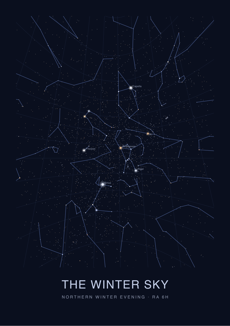 The Winter Sky
The print from this article · from €29.95
View the print →
The Winter Sky
The print from this article · from €29.95
View the print →
Scenario 3: The Reader Decoding a Finished Pollux Chart on the Wall
Picture a reader standing in front of the finished studio print. They have no catalogue, no software, no prior training in celestial coordinates. What can they get from the page, and how?
The dot labelled Pollux is 2.6 millimetres across. The legend at the bottom of the print maps dot radius to magnitude. Reading the legend backwards, the reader learns that this dot corresponds to a star of magnitude near 1. They now know, without any further work, that Pollux is one of the brighter stars on the plate — brighter than the vast majority of the sixty or so other dots in the Gemini field, dimmer than nothing except perhaps a magnitude-zero neighbour if one falls inside the crop.
The position is decoded from the grid, if the studio drew one. The reader finds Pollux inside the cell bounded by 7h and 8h in right ascension and +25° and +30° in declination. By linear interpolation against the nearest tick marks — the studio may have printed minor ticks every fifteen minutes of right ascension and every one degree of declination — the reader can recover 7h 45m and +28°. Those numbers are the same 7.75528 hours and +28.0262 degrees the HYG row started with, rounded to what a printed grid can resolve.
The context is where a wall print pays off. The reader sees Pollux joined by a line to Castor, and understands that the Twins are a pair. They see the Gemini boundary and understand where the constellation ends. They see the epoch note and understand that these positions are correct for the year 2000 reference frame, and that precession moves the coordinates slightly over decades — the studio does not have to re-plot for a wall print, because at the plate's printed scale the shift is imperceptible.
The reader can now take the print outside on a clear February evening, find the winter sky's brightest patch, and match the plotted pattern to what is overhead. The chart has done its job: three catalogue numbers, translated through a projection, a magnitude function, and a label, into a match the eye can complete.
What All Three Share: Three Numbers, Three Decisions
The catalogue row does not change across the three scenarios. Pollux is magnitude 1.16, right ascension 7.75528 hours, declination +28.0262 degrees in HYG v41. What changes is the number of decisions the drawer makes on top of that row.
The beginner makes three decisions: axes, dot size bin, label. The studio makes at least a dozen: projection, projection centre, magnitude cutoff, radius function, radius range, typeface, label style, constellation stick figure, IAU boundary, coordinate grid density, tick spacing, legend, epoch note, catalogue attribution. The reader makes one — trusting the legend enough to read the grid.
Every one of those decisions can be got right or wrong independently of the catalogue's accuracy. A studio that picks the wrong projection for the declination band will distort Gemini's shape even with flawless coordinates. A beginner who forgets that right ascension runs in hours, not degrees, will plot Pollux in the wrong cell of grid paper even with the correct number in hand. A reader who ignores the legend will see a big dot and read nothing beyond "bright star".
The pattern is that a star chart is a stack of translations. Each layer preserves or degrades the fidelity of the layer beneath it. The HYG catalogue is the base — three numbers with an attribution — and the map is what survives to the reader's eye through the stack. Chartmakers who print well are chartmakers who make the intermediate layers legible, which is why studio prints carry legends and epoch notes and beginner sketches do not.
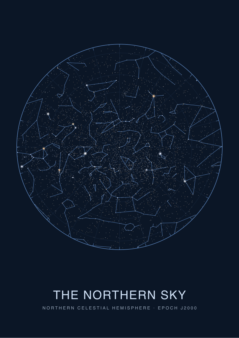 The Northern Sky
The print from this article · from €29.95
View the print →
The Northern Sky
The print from this article · from €29.95
View the print →
Which Scenario Is You
If you are learning celestial coordinates for the first time and have a single catalogue row in front of you, you are Scenario 1. Plot the dot. Get the RA-to-degrees conversion right. Do not worry about projections yet — one point on a flat grid is enough to build intuition.
If you are producing a print that other people will hang on a wall or open in an atlas, you are Scenario 2. The projection, the magnitude function and the legend are not decoration. They are what makes the print verifiable — what lets a reader with no catalogue access recover approximate coordinates from the page and trust the relative brightnesses.
If you have a chart on your wall and want to know what it is telling you, you are Scenario 3. Read the legend before you read the dots. Find the coordinate grid. Match the epoch to the year you care about. Then take the print outside — a chart that cannot be verified against the sky is decoration; a chart that can is a map. If a print of the winter sky is what would help you finish the exercise, our studio's own editions are the ones we plot from the same catalogue rows described here, and you can find them at /shop/.
Three numbers went in. Three drawings came out. The one you should keep is the one whose decisions you understand, because that is the one you can defend against the sky.
FAQ
What does apparent magnitude 1.16 actually mean for how Pollux appears on a chart?
Apparent magnitude is a logarithmic brightness scale in which lower numbers are brighter and each step of one magnitude corresponds to a brightness ratio of about 2.512. Pollux at magnitude 1.16 sits firmly in the first-magnitude band, meaning it is one of the brighter naked-eye stars visible from the northern hemisphere. On a printed chart, a studio typically renders that as one of the largest filled dots in the plate, second only to any magnitude-zero star that happens to share the field.
Why is right ascension given in hours instead of degrees?
Right ascension is measured along the celestial equator in the same units used to track the sky's rotation. Twenty-four hours of right ascension cover a full circle, so one hour equals fifteen degrees of arc. HYG v41 stores Pollux's value as 7.75528 hours, which converts to 116.3292 degrees. Chartmakers keep hours in the source data because it matches sidereal time directly, but they usually print hour-and-minute labels on the grid so readers can find the tick without doing the conversion.
What is the HYG catalogue and why do chartmakers use it for Pollux?
HYG is a compiled star catalogue that merges the Hipparcos, Yale Bright Star and Gliese catalogues into a single flat file, which is why chartmakers use it — one row per star with position, magnitude and identifiers in a format easy to plot from. Version 41 is a widely used snapshot. The Pollux row in HYG v41 is the source for the magnitude 1.16, right ascension 7.75528 hours and declination +28.0262 degrees this article uses throughout.
Does Pollux's position on a chart drift over time?
Yes, slightly. The Earth's axis precesses over a roughly 26,000-year cycle, which shifts the celestial coordinate grid against the stars at a rate on the order of 50 arcseconds per year. Most published charts, including those derived from HYG v41, use the J2000.0 epoch, meaning the coordinates are correct for the reference frame of the year 2000. For a wall-scale print the drift since then is imperceptible; for a precision astrometric application it must be corrected forward to the current date.
Why does the constellation abbreviation on the row read "Gem"?
"Gem" is the three-letter IAU abbreviation for Gemini, one of the eighty-eight constellations the International Astronomical Union fixed in 1930 with formal boundary lines. Every star in HYG v41 carries the three-letter code of the constellation region its coordinates fall inside. Pollux, at right ascension 7.75528 hours and declination +28.0262 degrees, sits inside the boundary of Gemini, which is why its row is tagged Gem regardless of how any particular chart chooses to draw the Twins.
Can Pollux appear on a chart without a stick figure connecting it to Castor?
It can, and often does on minimalist prints. The stick figure joining Pollux to Castor is a rendering convention, not a catalogue fact — HYG v41 does not store constellation lines, only the stars themselves. A studio that chooses to draw the Twins as a connected pair is layering a traditional Greek pattern over the coordinate plot. A studio that omits the line is showing the reader the raw geometry and letting the constellation form itself from the labelled dots.
How would a chart of Pollux differ for a southern-hemisphere reader?
The catalogue row is the same, and Pollux's declination of +28.0262 degrees is the same, but the sky-visibility context flips. From latitudes south of about −62°, Pollux never rises above the horizon at all; from mid-southern latitudes it appears low in the northern sky during the local winter months, upside down relative to a northern-hemisphere viewer. A chart intended for southern readers usually rotates the Gemini plate so that the sky-facing side matches the reader's actual view, but the underlying coordinates on the grid do not change.
From the collection
New charts and 10% off your first print.
One email now with your code. No noise after.