Think of this as a flowchart in prose. Before we cut a mat or order a moulding, we route the print through three questions, because black and white frames are not interchangeable finishes — they are two different readings of the same sky. A print showing Sirius at magnitude −1.44 sitting near Canopus at −0.62 behaves one way against black oak and another against a chalk-white maple, and the difference is not taste. It is contrast, distance, and what the eye reaches for first. We will ask the questions in the order a chartmaker asks them.
Question 1: Is the Wall Where the Print Will Live Bright or Dim?
The wall is the first frame, whether you like it or not. A star chart hung in a north-facing corridor at ten in the morning is doing different work than the same chart above a reading lamp at nine at night. The magnitude scale on the print does not change, but the eye adapts to the room before it adapts to the paper, and the moulding either extends the room into the print or interrupts it. That interruption is what a frame is for. Ask this first because everything downstream depends on it.
The reason to route by wall light before anything else: a black frame on a dim wall makes the print recede — the eye reads the moulding as a continuation of the shadow and then falls into the star field as if into an open window. A white frame on the same dim wall does the opposite. It punches a rectangle of paper out of the gloom and the moulding becomes a bright halo the eye has to cross to reach the sky. Neither is wrong. They are two entirely different reading experiences of an identical chart.
If Yes: The Wall Gets Real Daylight or Strong Lamps
Choose a black frame. The logic is contrast management. A bright wall already carries a lot of luminance, and a white moulding on a white-adjacent wall dissolves the edge — the print starts to feel like an unbounded poster rather than a plotted object. Black gives the chart a hard perimeter and, more importantly, it holds its own against the light bouncing off the wall. Arcturus at magnitude −0.05, the brightest star in Boötes at declination roughly +19°, needs that perimeter to register as a point rather than as a smudge in a well-lit rectangle. On a bright wall, black frames read as architecture. White frames read as absence.
If No: The Wall Is Dim, North-Facing, or Behind a Reading Nook
Choose a white or off-white frame. The reasoning inverts. In a dim room, a black frame merges with the wall shadow and the print floats — pleasant if you want the sky to hang unmoored, but the moulding stops doing its job. It no longer contains. A pale frame in low light behaves like a mat of daylight: it lifts the chart forward and gives the eye a place to rest before entering the star field. This is the choice we make most often for maps that will live in bedrooms and studies, where the print gets its most careful reading in lamp light and needs a boundary it can find in the dark.
Question 2: How Dense Is the Sky You Have Plotted?
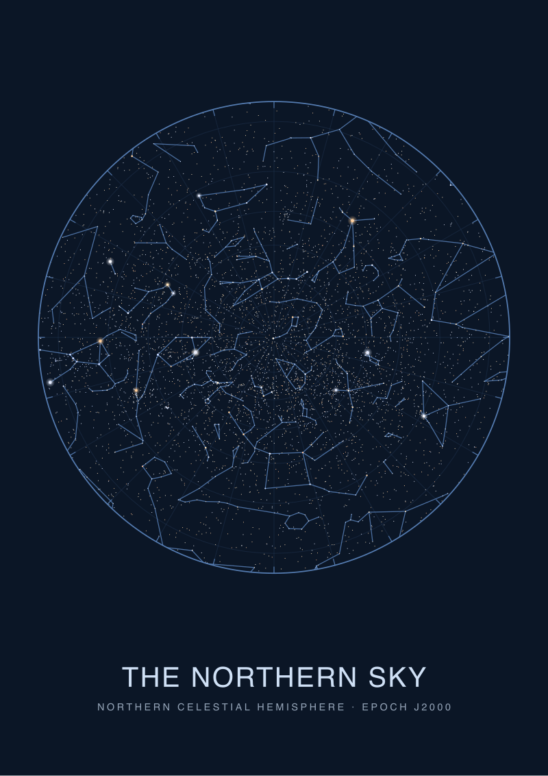
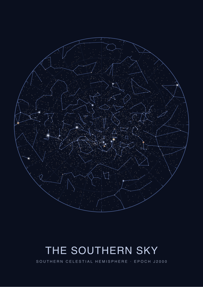
Not every star map carries the same weight of ink. A chart of the northern circumpolar sky, plotted down to magnitude 4.5, is a spare object — long empty tracts between Vega at magnitude 0.03 in Lyra and Capella at magnitude 0.08 in Auriga, with quiet negative space where the eye can breathe. A chart of the southern Milky Way, plotting Rigil Kentaurus at magnitude −0.01 next to the crowded fields of Centaurus and Carina, is a completely different object. It is dense with dots. The frame has to answer the density.
This is a question about ink coverage, not about aesthetics. A dense plot already gives the eye a lot of pattern to solve. A sparse plot asks the eye to sit longer with less. The frame has to either amplify what is there or protect what is not. Ask this second because it refines the answer from Question 1 — density can flip the recommendation.
If Yes: The Chart Is Dense — Milky Way Fields, Deep Magnitude Cutoff, Southern Hemisphere Bright Belt
Lean toward a white frame regardless of wall answer. Dense charts already carry their own contrast — every plotted star is a dark point against a light ground (or a light point against a dark ground, depending on how the print is inverted). A black frame around a dense white-ground chart doubles the perimeter weight and the whole object starts to feel heavy, like the frame is competing with the plot. A white frame on the same dense chart lets the plotted stars remain the darkest thing in the composition. The eye finds Canopus at magnitude −0.62 in Carina as the anchor of the crowded southern field, and the moulding stays out of the argument.
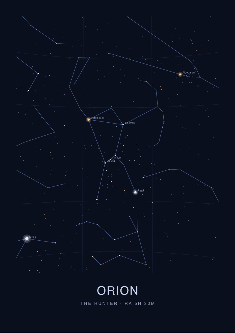
If No: The Chart Is Sparse — Circumpolar Views, Constellation Portraits, Small-Field Star Maps
A black frame does more work here. Sparse charts have generous empty space, and that space is part of the design — it is the sky between the stars. A black moulding treats that emptiness as continuous with the wall's shadow and lets the few plotted stars sit like real points of light rather than dots on paper. This is especially true for charts inverted to a black ground (white stars on black paper), where the frame extends the field. A white frame around a sparse black-ground chart creates a stark, almost graphic-design contrast — clean, but the print stops feeling like a sky and starts feeling like a poster.
Question 3: Are You Chasing the Drawing or the Object?
This is the question most framers skip, and it is the one that decides half the disagreements about black versus white. A star map can be hung for two very different reasons. Either the print is the object — a piece of paper you want to see as paper, with the plotting as craft evidence — or the drawing is the object, and the paper is a substrate you want to disappear. Framers who forget to ask this default to whichever moulding matches the room and then wonder why the print feels wrong.
We ask this third because it is the tiebreaker. Questions one and two often point in the same direction; when they conflict, this third question decides. A dense chart on a bright wall is a case in point — Question 1 says black, Question 2 says white, and the answer depends on whether the buyer wants the chart to read as a document or as a window.
If Yes: You Want to See the Print as a Print
Choose a white or natural-wood frame with a visible mat. The mat is the tell. You are treating the star map as a plotted document, an artifact of measurement, and you want the paper edge, the ink weight, and the marginal notation to be part of the viewing. White or pale mouldings do this best because they extend the paper visually — the frame becomes a formal extension of the mat, and the whole assembly reads as a technical drawing given proper archival respect. This is the right choice for charts that carry catalogue information in the margins, dated captions, or coordinate grids you actually want the viewer to read.
If No: You Want the Sky to Feel Like Sky
Choose a black frame, no mat or narrow mat, and consider a black-ground plot. Here the print is not a document — it is a small opening onto a night. The frame's job is to disappear into the darkness of the room and let Sirius at magnitude −1.44 sit in Canis Major without the eye being reminded that this is ink on paper. Black mouldings, particularly matte finishes rather than gloss, absorb the transition between wall and print and let the star field take over. This is the right choice for maps hung above beds, in stairwells, in quiet corners where the chart is meant to be lived with rather than studied.
If You Answered Everything: The Decision Table
Three yes/no questions produce eight combinations. Not all of them settle cleanly — the density and drawing-versus-object questions can override the wall answer, and the table shows where. Read your three answers across, find the row, take the recommendation. The recap is the map; the sections above are the reasoning.
| Q1: Bright Wall? | Q2: Dense Chart? | Q3: Print as Object? | Recommendation |
|---|---|---|---|
| Yes | Yes | Yes | White frame, wide mat — the density and the document-reading both push pale, wall brightness is overridden. |
| Yes | Yes | No | White frame, narrow mat — density wins over wall; the pale moulding still lets the plotted stars dominate. |
| Yes | No | Yes | Natural-wood or off-white frame, visible mat — a sparse chart as document; keep the paper visible. |
| Yes | No | No | Black frame, no mat — the bright wall gets its hard perimeter and the sparse sky reads as a window. |
| No | Yes | Yes | Off-white frame, wide mat — the dim wall needs lift; the document reading needs pale paper extension. |
| No | Yes | No | White frame, narrow mat — density still wants pale, and the dim room lets the pale moulding do the lifting. |
| No | No | Yes | White or natural-wood frame, wide mat — sparse and dim needs the frame to lift the paper into visibility. |
| No | No | No | Black frame, no mat, matte finish — sparse chart, dim wall, sky-as-window: the frame disappears completely. |
The pattern that emerges is not "black for bright rooms, white for dim rooms" — that is the shortcut framers use and it gets half the decisions wrong. The real pattern is that Q2 and Q3 override Q1 in most conflict cases. Density and intent decide the frame; the wall decides how hard the frame has to work. When density is high, pale mouldings almost always win. When intent is to see the drawing as a drawing, pale mouldings win again. Black frames are the answer for the specific case of sparse charts hung as windows, and that case is more common than the table suggests because most people who buy a star map want the sky, not the document.
Everything about this is reversible. A frame is a decision, not a commitment. If you order the moulding and hang the print and the wall was wrong or the drawing pushed a direction you did not expect, you re-frame. The chart does not change. Sirius is still at magnitude −1.44 in Canis Major, Vega is still at 0.03 in Lyra, the coordinates on the plot are still what the HYG catalogue said they were when we drew them. Only the reading changes. That is what a frame is for.
If a specific sky in this article is one you want to plot and frame for your own wall, we keep the star maps at browse the star maps — the same charts we route through the questions above.
FAQ
Does a black frame really make a star map look darker overall?
Not darker, but heavier. The moulding adds visual weight to the perimeter, and the eye reads that weight before it reads the plot. On a black-ground star map this can be a virtue — the frame extends the field. On a white-ground map it can be a problem because the dark border compresses the plotted stars into a smaller apparent field. If you want the sky to feel expansive, match the moulding to the ground the stars sit on.
Should I use a mat with a star map, or float it against the frame?
Use a mat if the chart is being read as a document — coordinate grids, dated captions, magnitude keys in the margin. The mat gives those elements room and formalizes the reading. Skip the mat if the print is meant to read as a window onto sky. A star map floated tight to the moulding, especially on a black-ground plot, disappears into the wall in a way that mats prevent. The choice is about intent, not archival practice.
What about wood tone — is oak versus walnut a meaningful choice for a star chart?
It is a meaningful choice for warmth, less so for contrast. Oak tends toward pale and cooler, walnut toward dark and warmer. A pale oak reads close to a white moulding for framing purposes and behaves the same way against wall light. Walnut sits closer to a black moulding but with more organic character. If you want the frame to belong to a warm room, walnut. If you want it to belong to the chart, oak or painted black.
Does the size of the print change the frame answer?
Yes, but predictably. Larger prints tolerate wider mouldings and can carry a heavier black frame without feeling crushed. Smaller prints — anything below A3 — almost always want a narrower, paler moulding because a bold frame around a small chart makes the whole object feel like the frame is the point and the sky is an accessory. Scale the moulding weight to the print, then apply the decision tree above.
Is glare a real issue for glazed star maps, and does frame color affect it?
Glare is a glazing question, not a frame color question. Non-reflective glass or museum-grade acrylic solves it regardless of moulding. Frame color only matters for glare in the sense that black mouldings around glossy glazing can reflect the room back at the viewer more visibly than pale mouldings do. If the print will hang opposite a window, choose non-reflective glazing before you argue about frame color.
Do star maps of the southern hemisphere frame differently than northern ones?
They tend to, because southern skies plotted from the Milky Way belt — Rigil Kentaurus at magnitude −0.01 in Centaurus, Canopus at −0.62 in Carina — carry higher star density and more visual weight. That density pushes toward pale frames per Question 2 above. Northern circumpolar plots, being sparser, more often tolerate black mouldings. It is not a rule of hemisphere, it is a rule of what got plotted.
Can I mix a black frame with a black-ground print, or is that too much?
It works well and is often the strongest option for a chart meant to read as a window. A black moulding around a black-ground plot eliminates the perimeter break — the frame vanishes and the plotted white stars sit in an unbounded darkness. This is the closest a framed print gets to feeling like a real opening onto sky. The trade is that the object loses its "print-ness" almost entirely, which is exactly the point of Question 3.
What if I plan to move the print between rooms?
Frame for the room where it will spend most of its time. A frame optimized for a bright living room will feel slightly off in a dim bedroom and vice versa, but the more common mistake is trying to average across rooms and ending up with a moulding that suits neither. If the chart will genuinely move, choose a natural-wood or off-white frame — the pale range travels better across lighting conditions than black does, which is more room-dependent.
From the collection
New charts and 10% off your first print.
One email now with your code. No noise after.