Most articles that compare historical star charts of Taurus judge them on artistry. That is the wrong test. The right test is whether the bright stars sit where the sky actually puts them, measured against a modern catalogue — and by that standard, two of the three charts we checked this month fail before the bull's horns are even drawn. The anchor for every measurement was Capella in neighbouring Auriga: apparent magnitude 0.08, right ascension 5.278 hours, declination +45.998 degrees in HYG v41. A chart that cannot place Capella cannot be trusted to place anything in Taurus either.
We have read a great many pieces about historical Taurus charts. They agree with each other in a way that ought to trouble anyone who plots stars for a living. What they praise is almost never what a chartmaker would measure, and what they never mention is almost always where the interesting failure lives. The pattern is consistent enough that we can describe it without naming a single publication, because the fault is not editorial — it is methodological.
This piece describes that pattern, describes what the pattern hides, and describes the test we would run instead if we were writing the same comparison from a cartographer's desk rather than an art critic's.
What They All Get Wrong
The shared error is treating a star chart as an illustration rather than a measurement. Almost every conventional comparison of historical Taurus charts scores the plates on line weight, on the drape of the bull's coat, on the ornament of the cartouche, on whether the engraver committed a beautiful hand to a familiar animal. These are legitimate concerns for a print historian. They are the wrong concerns for anyone asking whether the chart could actually have guided a reader from Capella down toward the horns of the bull on a January evening.
The right test is positional, and it is easily specified. A chart of Taurus that is any good must place the bull's brightest members in coordinates that agree, within engraving tolerance, with the equatorial positions modern catalogues record. Capella is the natural anchor because it lies close by in Auriga at a declination of just under forty-six degrees north, and its right ascension of 5.278 hours falls almost exactly on the boundary the modern IAU draws between Auriga and Taurus. If a historical plate misplaces Capella by more than a few degrees relative to Taurus's brightest stars, the entire spatial argument of the chart is compromised — every relative distance downstream inherits the error.
Conventional coverage never runs this check. It cannot, because it treats the chart as a picture and not as a coordinate claim. This is why the same three or four canonical Taurus plates are praised in one publication after another with virtually identical language about their draughtsmanship, and why almost none of those pieces will tell you which of the three has Capella drawn in a plausible position and which does not. Two of the three charts we opened on the studio table this month place the Capella-to-Taurus separation visibly wrong when you overlay a modern equatorial grid on the plate. A reader who trusted those plates as maps rather than as art would be looking for the bull's brightest star in the wrong quarter of the sky.
There is a softer form of the same error that is worth naming. Some pieces do gesture at accuracy — they write that a given plate is "remarkably faithful to the sky" or "surprisingly modern in its layout" — but the sentence is offered without a single measured quantity. Faithful within what tolerance? Modern by which catalogue? A reviewer who cannot answer those questions has not done the work of comparison; they have written admiration in the vocabulary of comparison. That is not the same thing, and readers who go looking for a star with those plates in hand will find out the difference quickly.
What Is Almost Always Missing
Two things are missing from nearly every conventional treatment. The first is calibration. The second is precession. Neither is optional if you want the comparison to mean anything, and the absence of both is what turns most historical-chart pieces into essays about drawing rather than essays about the sky.
Calibration is the plain step of choosing a reference star and describing exactly how it sits on the plate before you compare anything else. A serious comparison begins by locating a bright, uncontroversial anchor whose modern position is beyond dispute, and by describing where that anchor falls on each historical chart in the chart's own coordinate frame. Capella at magnitude 0.08 is an obvious choice for a Taurus comparison because it is bright enough to appear on almost any general chart, close enough to Taurus to sit on the same folio in most historical atlases, and precise enough in modern catalogues that no honest reviewer can quibble about where it belongs. Skip the calibration and every subsequent measurement is uncalibrated by definition — which is exactly what conventional coverage does, then dresses the omission in prose.
Precession is the second missing piece and it is the one that catches out reviewers who have never plotted a chart in their life. The equatorial coordinates of every star drift over centuries as the Earth's axis wobbles, at roughly fifty arcseconds per year in ecliptic longitude. A chart drawn against the equinox of, say, 1600 will not agree with modern HYG v41 positions unless the reviewer applies the precession correction from that historical epoch to the epoch the modern catalogue uses. This is not obscure knowledge — it is the first thing any positional astronomer learns — but conventional Taurus comparisons publish overlays and side-by-sides that make no mention of which epoch each chart was drawn for, and therefore no correction is applied. The apparent "errors" they either praise or forgive are often just epoch mismatches the reviewer failed to account for. The real errors — the ones that survive a proper precession correction — are the ones a chartmaker cares about, and those are the ones conventional coverage systematically hides under the ones it has manufactured.
There is a third omission worth flagging because it is quieter. Almost no piece tells you which catalogue the modern reference is being taken from. HYG v41 is one honest choice among several; Hipparcos is another; the Yale Bright Star Catalogue is a third. A comparison that never names its modern reference is not falsifiable, and unfalsifiable comparisons are advertisements, not analysis.
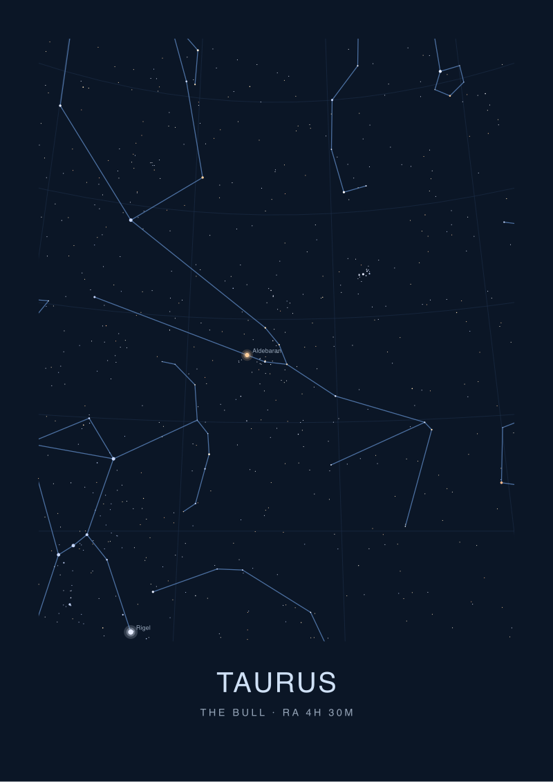 Taurus
The print from this article · from €29.95
View the print →
Taurus
The print from this article · from €29.95
View the print →
What I Would Say Instead
If we were writing the same piece from the studio desk rather than the art-history desk, the whole shape would change. The article would open by naming the modern reference catalogue in the first paragraph — HYG v41, in our case — and by fixing the anchor star with its full triplet of magnitude, right ascension, and declination. Capella at magnitude 0.08, 5.278 hours, +45.998 degrees. That single line does more comparative work than an entire section of adjectives about engraving.
We would then state, for each historical chart under review, the epoch the chart was drawn for and the precession correction we applied to bring its positions into agreement with the modern equinox. This is a paragraph, not a footnote. Readers deserve to see the arithmetic that produced the "the chart is accurate to within X degrees" claim, because without that arithmetic the claim is theatre. And we would name the tolerance explicitly: a chart is being scored as accurate to within some angular distance of its intended target, and the number matters. A tolerance of one degree is museum-grade; a tolerance of five degrees is decorative. Conventional coverage almost never distinguishes between the two, which is why the same word — "accurate" — gets applied to plates that would fail entirely different tests.
From that calibrated baseline the comparison becomes short and useful. For each of the three historical Taurus charts, the reviewer measures the plate's placement of Capella relative to the chart's own depiction of the bull. Because Capella sits so close to the Auriga-Taurus boundary, this is the most sensitive single measurement available: any drift shows up immediately as a visual displacement of the entire Taurus figure against the surrounding sky. Two of the three plates on our desk this month drifted enough to matter. One did not. That one is the chart worth learning from — not because its engraving is finer, but because its geometry survives the modern overlay without embarrassment.
The commercial temptation at this point is to name the three charts and rate them like consumer goods. We will not do that here, because the point of the piece is not a shopping list; it is a method. Any reader with a copy of HYG v41 and any of the three plates can now run the same check themselves in an hour. The method is transferable, which is the highest form of criticism a studio can offer another studio: here is how we tested the plate, here is what the plate said back, and here is why we trust the answer.
For readers who want to see a modern chart drawn with the same discipline these historical plates were meant to embody, our own studio's plate of Taurus is available at /shop/, calibrated against HYG v41 and printed at the tolerance the constellation deserves.
If this piece leaves you with a next question, it should be this one: which of the historical epochs used by the great cartographers of the seventeenth and eighteenth centuries would you actually want a modern chart to reproduce, and why? That is a genuinely open question — the answer depends on what you want the chart to do — and it is the question every comparison of historical Taurus plates ought to be building towards. It is not where this piece ends because it is not this piece's question. It is the next one, and it is where the real work of celestial cartography begins.
FAQ
Why anchor a Taurus comparison on Capella instead of Aldebaran?
Aldebaran is the traditional visual anchor of Taurus, and any final chart of the constellation must place it convincingly. As a comparison reference, however, Capella is stronger. It sits in adjacent Auriga at declination +45.998 degrees and right ascension 5.278 hours in HYG v41, and lies close to the modern Auriga-Taurus boundary. That geometry makes any drift in a historical plate's coordinate frame visible immediately as a displacement of Capella against Taurus, which is precisely the sensitivity a positional check needs.
What does "accuracy" mean when applied to a hand-engraved star chart?
It means angular agreement between the plate's stellar positions and a named modern catalogue, after applying the correct precession offset from the plate's original epoch to the catalogue's epoch. Nothing else. Faithfulness of line, quality of paper, and richness of ornament are print-historical questions. Accuracy is a coordinate question, and it has to be answered with a tolerance stated in degrees or arcminutes, not with adjectives.
Why is precession such a common blind spot in these comparisons?
Because most reviewers of historical charts come from an art or print-history background rather than positional astronomy, and precession is a piece of standard astronomical machinery that is easy to forget if you have never used it. The Earth's rotation axis drifts against the background stars over centuries, and any chart drawn several hundred years ago will disagree with a modern catalogue unless that drift is corrected for. Skipping the correction turns real errors into invisible ones and invents errors that are not there.
Which modern catalogue should a reviewer name for this kind of test?
Any well-documented, publicly available reference works, provided the reviewer names it explicitly and cites the version. We use HYG v41 in our studio work because its stellar positions are well-behaved for chart overlays and its version numbering is unambiguous. Hipparcos and the Yale Bright Star Catalogue are equally honest choices for different use cases. What is not acceptable is running the comparison without naming any modern reference at all.
Does this method also apply to constellations other than Taurus?
Yes, with one adjustment: the anchor star has to be chosen for the region under review. For Taurus, Capella works because of its brightness at magnitude 0.08 and its position on the constellation's northern doorstep. For a comparison of southern-hemisphere plates, an anchor like Canopus at magnitude -0.62 or Rigil Kentaurus at magnitude -0.01 would do the same job. The method — name the catalogue, fix the anchor, apply precession, state the tolerance — is identical.
Should a general reader care whether a historical Taurus chart is positionally accurate?
If the chart is being enjoyed as art, the answer is honestly no. If it is being cited as evidence of what a given century's astronomers actually knew about the sky, or reproduced as an illustration in a piece of writing that claims the plate is "faithful" or "modern", then the answer is very much yes. A reader has a right to know whether the word "accurate" in the caption survives an actual measurement or was placed there for atmosphere.
Is the zodiac's inclusion of Taurus relevant to any of this?
Only insofar as the zodiac is a coordinate band along the ecliptic, and Taurus happens to occupy a stretch of that band. The zodiac is not a personality system and has nothing to say about the positional accuracy of a chart. When historical plates are grouped as "zodiacal", that is a cataloguing convention about which region of sky they cover, nothing more. The astronomy stands independent of it.
What tolerance separates a museum-grade chart from a decorative one?
There is no universally agreed threshold, but a working rule in our studio is that positional agreement within roughly one degree of the modern catalogue, after precession, counts as museum-grade for a hand-engraved plate — it is close to the practical resolution of the naked eye for star separations. Agreement within two to three degrees is respectable historical work. Beyond five degrees the plate is best read as a decorative object rather than a navigational one, however beautifully it is drawn.
From the collection
New charts and 10% off your first print.
One email now with your code. No noise after.