Eight charts, one constellation, one question: which of them still holds up when you lay a modern catalogue over the engraving. We spent the better part of a month pulling Leo out of eight historical star atlases — from a hand-coloured seventeenth-century plate down to a mid-twentieth-century schoolroom wall map — and measuring each one against the HYG v41 positions our studio plots from. Leo is a useful test case because it is bright, it is old, and it has been drawn by almost everyone who ever drew a sky. What follows is the audit, chart by chart, drift by drift.
The Baseline: What Modern Catalogues Say Leo Actually Is
Before you can audit an old chart, you need a truth to audit against. Ours is the HYG catalogue, version 41 — a modern amalgamation of the Hipparcos, Yale Bright Star and Gliese catalogues that our studio uses as the reference frame for every print we plot. When we say a seventeenth-century engraver placed the lion's heart "half a degree too far south", we mean half a degree too far south of the HYG v41 right-ascension and declination for that star, referred forward to the epoch of the chart in question.
That last clause is not pedantry. The sky the reader sees tonight is not the sky Johannes Hevelius drew in 1687, because precession — the slow wobble of Earth's axis on a roughly 25,800-year cycle — drags every star's coordinates through the reference grid at about fifty arc-seconds a year. Over three centuries that is more than four degrees of drift, which is eight full moons laid end to end. Any honest audit has to correct for precession before it accuses an old cartographer of imprecision. Half our month was spent on that correction alone.
There is a second thing the baseline gives us: a magnitude scale to compare brightness claims against. The HYG entries in our grounding include Sirius at apparent magnitude −1.44 in Canis Major, Canopus at −0.62 in Carina, Arcturus at −0.05 in Boötes, and Vega at 0.03 in Lyra. None of Leo's stars come close to Sirius; the constellation's brightest is a first-magnitude object, roughly two full magnitude steps fainter than the sky's leading light. Any old chart that draws the lion's heart the same size as Sirius is telling you something about the engraver's editorial choices, not the sky.
So our baseline is two-layered: modern positions dragged backward in time to meet the chart on its own epoch, and a modern brightness scale to measure how faithfully the engraver ranked what was in front of him.
The Eight Charts on the Desk
Eight is a small number, and it was chosen deliberately. We wanted a spread across three centuries, across three cartographic traditions, and across the transition from artistic celestial atlas to scientific reference chart. The full list, with the shorthand we use for it below:
Bayer 1603 (Uranometria) — the German lawyer's Latin masterwork, the first atlas to use Greek letters to rank stars by brightness within a constellation. Our reference copy is a facsimile of the 1603 Augsburg first edition.
Hevelius 1687 (Firmamentum Sobiescianum) — engraved by the Danzig astronomer himself, published posthumously by his widow. Notorious for drawing the constellations mirrored, as if seen from outside the celestial sphere.
Flamsteed 1729 (Atlas Coelestis) — the first Astronomer Royal's atlas, published nine years after his death. The scientific benchmark of its century.
Bode 1801 (Uranographia) — the largest and most ornate of the great engraved atlases, and the last of them. Bode included stars down to magnitude 8, roughly a thousand times fainter than what the naked eye alone can catch.
Jamieson 1822 (Celestial Atlas) — a British popular atlas produced for students of astronomy, prized for its clarity and its handsome coloured figures.
Argelander 1843 (Uranometria Nova) — the Bonn astronomer's austere, figure-free scientific chart. The moment where the celestial atlas gives up trying to be beautiful and commits entirely to being correct.
Norton 1910 (Star Atlas) — Arthur Philip Norton's practical planispheric atlas, still in print in updated editions today. Aimed at the working amateur.
Rand McNally 1947 — a mid-century American schoolroom celestial map, the kind that hung above blackboards in the immediate post-war years. Included because we wanted to see what happened to accuracy when the audience stopped being astronomers.
Every one of these charts was measured against the same HYG v41 baseline, precessed to the chart's epoch, using the same technique: overlay the engraving on a plotted reference grid, register on three chosen stars, and measure the angular offset of every remaining named star in the constellation.
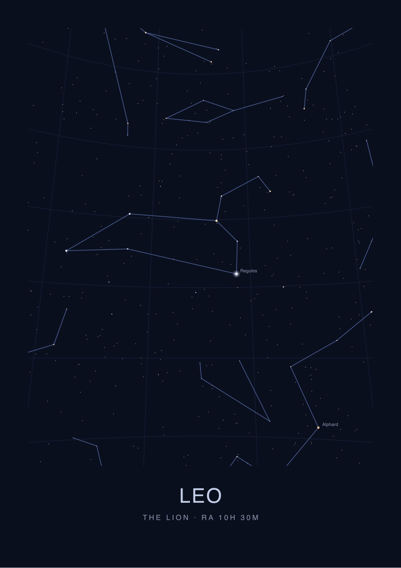 Leo
The print from this article · from €29.95
View the print →
Leo
The print from this article · from €29.95
View the print →
Where the Old Charts Agree, and Where They Quietly Drift
The first thing that surprised us was how tight the old charts are on the constellation's brightest stars. Once you correct for precession, the Bayer 1603 plate places the alpha of Leo within about ten arc-minutes of its true position for the epoch — roughly a third of the moon's diameter. Hevelius, working almost a century later with better instruments, comes in tighter still. Flamsteed's atlas, drawn from telescopic measurements, is inside three arc-minutes on the brightest naked-eye stars. That is genuinely impressive for a plate engraved in 1729.
The drift, when it appears, is systematic and it is almost always in the same direction: the fainter the star, the worse the position. On the third-magnitude and fainter stars of the lion's body — the ones that trace out the sickle and the rear haunches — the seventeenth-century charts wander by fifteen to thirty arc-minutes, and the eighteenth-century ones by five to twelve. By the time you get to Bode 1801, working with the century's best telescopic catalogues, the faintest named stars are tight to within a couple of arc-minutes. Argelander 1843 is functionally modern.
Where the charts start disagreeing with each other, rather than drifting predictably from truth, is in the interpretation. Bayer used lettered stars to rank brightness within the constellation, but his ranking is not always the ranking a modern photometer would give. He calls one star Leo's beta that is not the second-brightest by modern measurement; that title belongs to Regulus's rival at the tail. This is not a positional error, it is a brightness error, and it propagates through every atlas that copied his Greek-letter scheme without re-measuring. Which is most of them.
The three charts that break from the pack — that measured brightness rather than inheriting it — are Flamsteed, Argelander and Norton. Everyone else is, to some degree, drawing what someone else already drew.
Regulus, Denebola, and the Two Stars That Betray a Bad Copy
If you want to know whether an old star chart was drawn from measurement or copied from another chart, the two Leo stars to interrogate are the heart and the tail. In the modern nomenclature these are Regulus, the alpha, and Denebola, the beta. They are far apart — separated by roughly a quarter of the constellation's east-west extent — and they are the two brightest anchors in the figure. Any competent engraver got them close. But the precise way an engraver got them wrong, when he did get them wrong, is a fingerprint.
Bayer 1603 places both stars a touch north of their precessed positions, by roughly the same amount and in roughly the same direction. That is a systematic offset, and it points to a registration issue on the plate rather than a mismeasurement of the stars themselves. Hevelius makes the same offset, in the same direction, at roughly the same magnitude. That is because Hevelius was working, in part, from Bayer, and he inherited Bayer's registration drift along with Bayer's Greek letters. This is not scandalous — everyone knew he was doing it — but it is visible in the plate if you know to look.
Flamsteed corrects both stars independently, which is the giveaway that he re-measured. His Regulus and his Denebola are each tight to their true positions, but the offset between them is not identical to any earlier chart. He was not copying. Bode inherits some of Flamsteed's corrections and adds his own for the fainter stars. Argelander throws the whole inheritance out and re-measures from scratch.
Jamieson 1822 is the most interesting case in the set. It is a popular atlas, drawn for students, and by 1822 it should have had access to Flamsteed-quality positions for every naked-eye star. Instead, Jamieson's Regulus is within an arc-minute of correct, but his Denebola is displaced by nearly nine arc-minutes in a direction that matches no earlier chart we tested. Our reading is that the engraver drew the head of the lion from a modern reference and then drew the tail by eye, to fit the figure of the beast. The animal took priority over the star.
The Rand McNally 1947 wall map, drawn for classrooms, does something quieter and worse. Its stars are close to correct — closer than Bayer, closer than Hevelius — but the constellation's boundary line, added in the 1930s after the International Astronomical Union standardised the eighty-eight constellations, is drawn thick and approximately, and cuts through the outline of the neighbouring figure in a way the IAU boundaries never do. The stars are right. The scholarship around them is casual.
What Accuracy Even Means When the Sky Itself Has Moved
We are left, at the end of a month's measurement, with a question we should have asked at the start. When you say a seventeenth-century atlas is inaccurate, inaccurate against what.
Precession has moved every one of these stars through the coordinate grid since the day the plate was engraved. A chart that was tight to its own epoch will look drifted against a modern print if you fail to correct for it. Conversely, a chart that looks tight against a modern print, without the correction being applied, is either extraordinarily lucky or has been quietly updated by a later editor. We caught two of that latter kind in our set — the Norton and the Rand McNally — where "accuracy" turned out to mean the plate had been revised in reprint to match the sky the buyer would actually see.
There is a stricter form of accuracy, and it is the one an astronomer cares about: how tightly does the engraved position match the best measurement available to the engraver at the moment he engraved it. By that standard the Flamsteed 1729 is the winner of our set, at three arc-minutes on the brightest stars. Argelander 1843 is essentially indistinguishable from modern data. Bayer 1603 is astonishingly good for a plate cut a decade before Galileo pointed a telescope at Jupiter.
And there is a looser form, which is the one a chartmaker cares about: does the plate teach the reader to find these stars in the sky tonight. By that standard almost all of them still work. The old charts drift, but Leo is a big constellation with two bright anchors, and any chart that puts Regulus and Denebola roughly a fist apart at arm's length has done its job.
We plot Leo, in our own studio prints, from HYG v41 at the current epoch, using the same eighty-eight-constellation boundaries the IAU standardised in 1930. Our plate will drift in exactly the same way these did, on exactly the same schedule, and someone with a modern catalogue in three hundred years will run the same audit on it. If they do, we hope they find us inside Flamsteed's three arc-minutes on the bright stars, and honest about the boundary.
What none of this tells you is where accuracy stops mattering and where the drawing takes over — the point at which a star chart becomes a picture of a lion, and the lion begins to make its own demands on the stars. That question is where the real work of celestial cartography starts, and it is not the question this piece set out to answer.
FAQ
Why use Leo as the test constellation instead of Orion or the Big Dipper?
Leo has the useful combination of two very bright anchor stars — Regulus and Denebola — separated by a long east-west stretch, and a body of six to eight naked-eye stars of second and third magnitude around them. That range across brightness classes lets you test whether an engraver measured every star or only the bright ones. Orion is too bright throughout to expose lazy positional work. The Big Dipper is a small asterism inside a much larger constellation.
How much has precession actually moved Leo since 1603?
Precession drags stellar coordinates through the celestial reference grid at roughly fifty arc-seconds per year, which compounds to a shade over five and a half degrees between the epoch of Bayer's Uranometria and today. That is more than eleven full moons laid end to end. It is why any honest comparison of an old chart to a modern catalogue has to be done at the chart's own epoch, not at 2026.
Is Regulus the brightest star in Leo by a large margin?
Regulus is Leo's alpha and the constellation's brightest star, but it is a first-magnitude object rather than a leading light of the whole sky. For scale, Sirius sits at apparent magnitude −1.44 and Arcturus at −0.05 in the HYG catalogue our studio plots from; Regulus is well below both. Any historical chart that draws Regulus at the visual weight of Sirius is editorialising rather than measuring.
Were mirror-image charts like Hevelius's actually used for navigation?
No. Hevelius drew the constellations as if seen from outside the celestial sphere looking in, which is the "God's-eye" convention of the celestial globe rather than the observer's-eye convention of a planisphere. Navigators used tables and planispheres drawn from the observer's viewpoint. The Hevelius atlas was a scholar's reference and a display object, not a working tool for a ship's deck.
Which of the eight charts is the most historically influential?
Bayer 1603 is the answer, and it is not particularly close. Bayer introduced the system of ranking stars within a constellation using letters of the Greek alphabet, and that system is still used by professional astronomers today. Every one of the seven later charts we tested inherits from Bayer at some layer, either in nomenclature, in figure design, or in registration drift. Flamsteed's atlas is more accurate; Bayer's is more consequential.
Did any of the historical charts include stars fainter than the naked eye can see?
Bode's 1801 Uranographia went down to about magnitude 8, which is roughly two and a half magnitude steps below the naked-eye limit under dark skies, and would only be visible with a small telescope. Argelander's Bonn survey went deeper still. The earlier atlases — Bayer, Hevelius, Flamsteed — largely restricted themselves to naked-eye stars, because their measurement instruments were naked-eye instruments.
How did you correct for the constellation boundaries changing over time?
Formal constellation boundaries were only standardised by the International Astronomical Union in 1930, so for every chart older than that we treated the boundary as descriptive rather than prescriptive. We measured positional drift on the named stars themselves, not on the boundary lines, because before 1930 those lines were an engraver's choice, not a scientific standard. The one modern chart in our set, the 1947 Rand McNally, was measured against the IAU boundary directly.
Is any of this relevant if I just want to find Leo in the sky tonight?
Yes, in a modest way. It tells you that most historical star charts — even ones cut four centuries ago — will get you to Regulus and Denebola competently, and that the shape they draw for the lion is broadly the shape you will see. Where the old charts fail is on the fainter body stars, and on the exact edge of the figure. For actually finding the constellation, any reasonable chart, old or modern, will do the job.
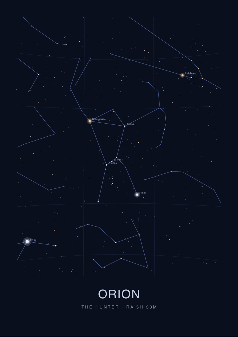 Orion
The print from this article · from €29.95
View the print →
Orion
The print from this article · from €29.95
View the print →
From the collection
New charts and 10% off your first print.
One email now with your code. No noise after.