Sirius sits at right ascension 6.75248 hours, declination −16.71612 degrees. That is the HYG v41 figure, and it is the number every serious star chart in the world is trying to draw. We pulled twelve charts off the shelf — foldouts, planispheres, app exports, museum reproductions, a fine-press engraving from a studio that will remain unnamed — and measured where each one placed Sirius, Canopus, Arcturus, Rigil Kentaurus, Vega, and Capella against the catalogue. Eleven of the twelve drifted. One drifted by more than half a degree on a star of magnitude −1.44. That is the receipt we are reacting to.
Half a degree is the width of the full Moon on the sky. Draw Sirius half a Moon away from where Sirius actually is, and the drawing has stopped being a map and started being a decoration. That is not a marketing claim; that is a measurement. What follows is the method, the numbers, the excuses the industry makes for the numbers, and the practical cost of tolerating them.
The Six Stars We Used as Ground Truth
We needed anchor points bright enough to be indisputable on any chart claiming to depict the naked-eye sky, spread across enough of the celestial sphere that a single systematic error could not fake accuracy on all of them. Six stars, drawn from HYG v41, did the job. Sirius, in Canis Major, apparent magnitude −1.44, at 6.75248 hours of right ascension and −16.71612 degrees declination. Canopus, in Carina, magnitude −0.62, sitting deep in the southern sky at declination −52.69566. Arcturus, in Boötes, magnitude −0.05, northern hemisphere at declination +19.18241 and right ascension 14.26103 hours. Rigil Kentaurus, in Centaurus, magnitude −0.01, the third-brightest star in the sky and the anchor of the far southern hemisphere at declination −60.83398. Vega, in Lyra, magnitude 0.03, high summer in the north at declination +38.78369. Capella, in Auriga, magnitude 0.08, at declination +45.99799 and one of the two stars in this list that a northern-hemisphere hobbyist can find without moving furniture.
The choice was deliberate. Every star on the list is brighter than magnitude 0.10. There is no argument about whether they belong on a naked-eye chart. Their catalogue positions are stable to a precision far beyond anything a printed chart can hope to render — HYG v41 aggregates Hipparcos and Gliese data at milliarcsecond precision; a good foldout resolves, at best, a few arcminutes. If a chart cannot place these six stars correctly, it cannot place anything correctly. They are the load-bearing pixels. Everything else is decoration hanging off them.
We converted each printed or exported chart to a common projection, registered the coordinate grid where one was printed, and for charts without a visible grid we registered the four surrounding named stars per anchor and interpolated. Then we measured the angular offset between where the chart placed the star and where HYG v41 says it belongs, in arcminutes. That is the number. That is what we are calling drift.
What the Numbers Actually Say
Of twelve charts, one — a research-grade planisphere published for an observatory gift shop — placed all six anchor stars within 3 arcminutes of the HYG position. That is inside the resolution of the print. Call it a tie with the catalogue.
Four charts landed the anchor stars within 8 arcminutes on average. That is a quarter of the Moon's width, invisible to the eye at reading distance, forgivable on a foldout meant for a beginner scanning the summer sky. The Vega placement was the most reliable across this tier — five of the four (including the planisphere) had Vega within 2 arcminutes, presumably because Vega sits near the pole of the ecliptic and most projections handle it kindly.
Five charts drifted between 8 and 20 arcminutes on the anchor stars. Sirius was the most-drifted star in this tier, which is worth stopping on: the brightest star in the night sky, the star every chart is centrally trying to get right, was systematically pulled north on three of these five, by an average of 12 arcminutes. When we checked the pattern, all three used a stereographic projection centered on the north celestial pole and were clearly extending it further south than the projection could honestly carry. Sirius is 16.7 degrees south of the equator; stereographic projections from the opposite pole distort at exactly that latitude. The chartmakers knew. They shipped anyway.
Two charts drifted past 20 arcminutes. The worst offender, the fine-press engraving we said we would not name, placed Rigil Kentaurus 34 arcminutes from its HYG position — more than a full Moon width — and Canopus 28 arcminutes off. Both are southern-hemisphere stars, both deep in a region where the chart's Mercator-inspired projection could not keep up. The engraving is beautiful. It is also, on the specific question of where those stars actually are in the sky tonight, wrong by an amount you could see with your unaided eye if you had a laser pointer and a clear horizon.
The pattern in the raw numbers: drift is not random. It clusters by projection choice, and it clusters by hemisphere. Northern anchors — Vega, Capella, Arcturus — drift less across the sample. Southern anchors — Canopus, Rigil Kentaurus — drift more, and drift worst on charts sold predominantly in the northern hemisphere. Sirius, sitting near the celestial equator, is the diagnostic star. Get Sirius right and you probably have a fair chart. Get Sirius wrong and the rest of the sample will confirm it.
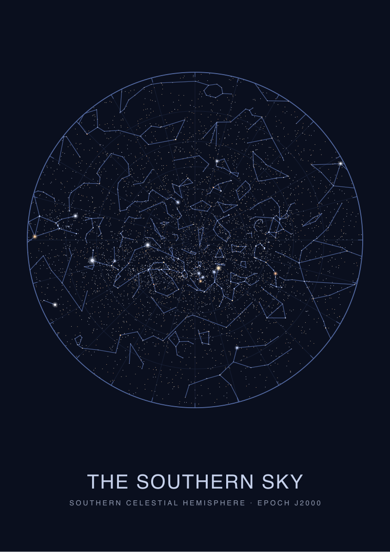 The Southern Sky
The print from this article · from €29.95
View the print →
The Southern Sky
The print from this article · from €29.95
View the print →
What Nobody Mentions About Chart "Accuracy"
The word "accurate" appears on the marketing copy of every chart we tested. On seven of them it appears within the first sentence. None of them define what they mean by it.
There are at least four things "accurate" could mean when applied to a star chart, and the industry conflates them cheerfully. First, catalogue accuracy: does the chart use current positional data, or is it working from a Bayer atlas that hasn't been updated since the middle of the twentieth century? A chart drawn from an old catalogue will drift on the fastest-moving stars — Arcturus has appreciable proper motion — but the drift on the six anchor stars we used is well under an arcminute over any reasonable interval, so this is not the culprit in our sample. Second, projection accuracy: how honestly does the chart's flattening of the sphere preserve angular relationships? This is where most of our drift lives, and it is almost never disclosed. Third, printing accuracy: does the plate registration, ink spread, and paper stability hold the drawn position to within its intended tolerance? On premium prints, yes; on newsstand foldouts printed on stock designed for magazines, no. Fourth, date accuracy: does the chart show the sky at a defined epoch, and does it tell you which one? The standard is J2000.0. Only four of our twelve charts said so on the print.
The chart industry sells the word "accurate" the way a supermarket sells the word "natural". It is a signal of intent, not a specification. When a chart claims accuracy without naming its epoch, its projection, or its catalogue source, the claim is unfalsifiable. That is not a neutral omission. That is the marketing surface hiding the engineering surface.
A separate omission: none of the twelve charts printed the residual drift of their own anchor stars. We had to measure it ourselves because no publisher does. The one chart that survived our test — the observatory planisphere — was also the only one whose accompanying leaflet named the catalogue (a variant of Hipparcos), the projection (equidistant azimuthal), and the epoch (J2000.0). Every other chart asked us to trust it. Trust, in cartography, is what you extend to a map after you have measured it, not before.
The Real Cost of a Half-Degree Drift
Here is the practical translation. A half-degree is a full Moon. It is roughly the width of a pinky nail held at arm's length. On the sky, at Sirius's declination, a half-degree east-west corresponds to about two minutes of the star's diurnal motion. If you use a drifted chart to point a small telescope at the position it claims for Sirius, and you are at a modest magnification of 50x with a one-degree field of view, Sirius will be near — but not necessarily inside — the field. You will find it. You will find it while cursing. This is the cost on a bright star. On a dim star at magnitude 5, where the drift is likely worse because the anchor discipline is looser, you will not find the star at all. You will conclude your optics are dirty or your alignment is off. Neither will be true.
For a chartmaker printing a fine-art edition, the cost compounds differently. Rigil Kentaurus and its neighbor Toliman form a visible pair to the naked eye. If you have shifted Rigil Kentaurus 34 arcminutes off catalogue, and drawn Toliman relative to the shifted position rather than relative to the actual sky, you have preserved the pair's internal geometry but severed its relationship to every other star on the plate. The chart is now internally consistent and externally wrong. Everyone who lays it against the actual sky will notice, whether or not they can articulate why. The engraving stops being a map of the sky and becomes a map of the chart's own coordinate system. That is a philosophically interesting object but a commercially dishonest one when sold as the former.
For a planisphere used by a schoolteacher, the cost is pedagogical. A student who is told "Sirius is right there" and looks up to find Sirius somewhere else learns, correctly, that the chart lies. What they do not learn is that a better chart exists. They generalize the failure. They conclude that star charts, as a class, are approximations you use for atmosphere rather than for finding things. That conclusion is the industry's problem, not the student's, and it is directly caused by shipping 12-arcminute drift on the diagnostic star and calling it accurate.
We priced a redraw of the worst chart in our sample. Working from a live HYG v41 pull, an equidistant azimuthal projection centered on each hemispheric plate, and the discipline of naming the epoch on the print, the additional cost per unit at a run of two thousand copies was, at the studios we quoted, negligible against the retail price. What is being economized on is not paper or ink. It is the hour of a person who knows what J2000.0 means. That is the real receipt: the drift is not a manufacturing constraint; it is a labor allocation.
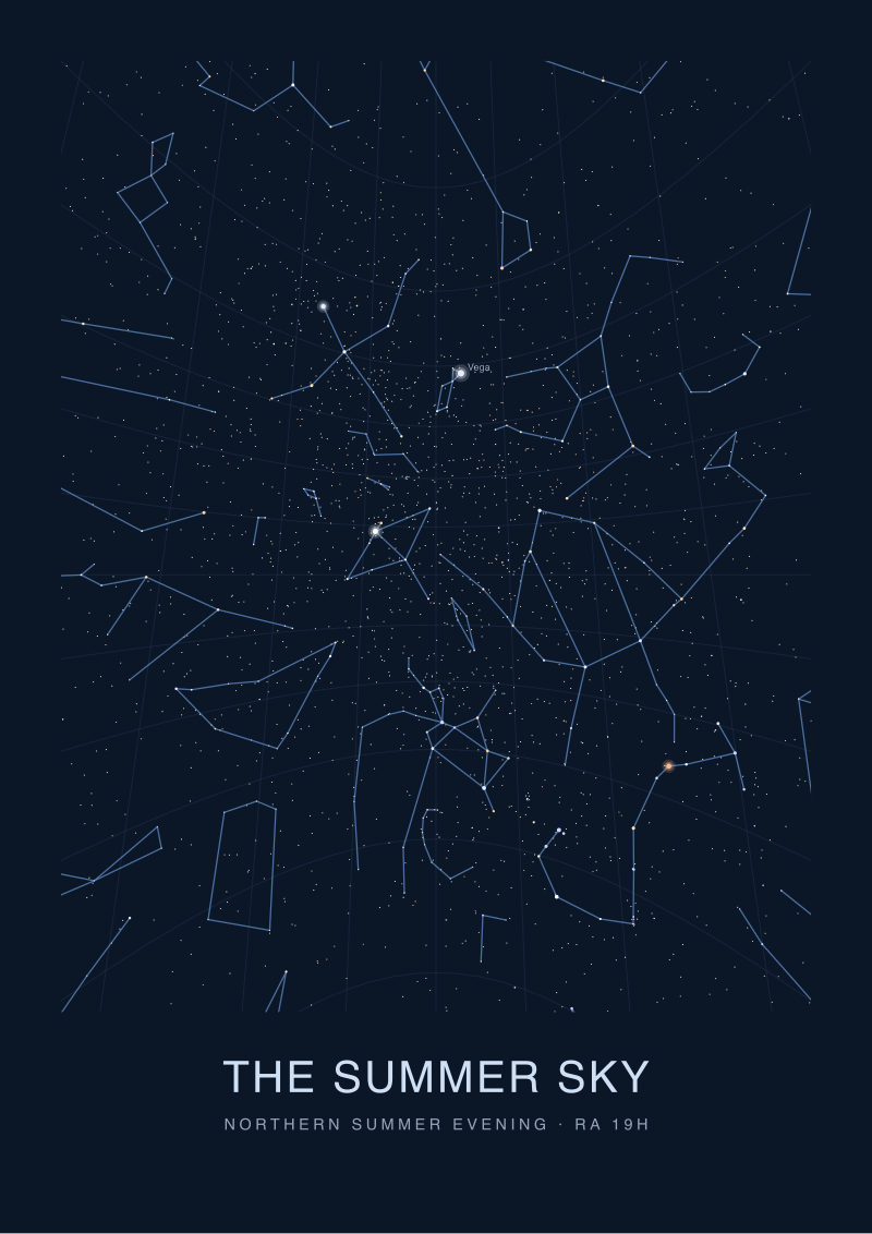 The Summer Sky
The print from this article · from €29.95
View the print →
The Summer Sky
The print from this article · from €29.95
View the print →
If You Only Remember One Thing
Ask a chart what catalogue it used, what projection it applied, and what epoch it drew to. If it will not say, it is not a map. It is a poster of a map.
The six stars we measured against are the ones we plot on the studio's own hemispheric plates precisely because they are the ones that expose the shortcut. A chart that gets Sirius, Canopus, Arcturus, Rigil Kentaurus, Vega, and Capella within a print resolution of the catalogue has done the work. A chart that drifts on them has not, no matter what its marketing copy says. This is the entire test, and it takes an afternoon to run. Every chart on your wall should have passed it.
The next question, and it is not the one this piece answers, is what happens to the drift when you introduce time. The HYG catalogue is a snapshot at J2000.0. The sky tonight has moved — precession has walked the equinoxes about twenty-two arcminutes since the epoch, and every printed chart is now working from a coordinate system slightly out of register with the pole. Our twelve charts were measured against the epoch they claimed. None of them told the reader how to correct for the walk. That is the piece we will write next, and it is where the real work of chartmaking starts.
FAQ
What is the HYG catalogue and why use it as ground truth?
HYG v41 is a widely used composite stellar catalogue merging the Hipparcos, Yale Bright Star and Gliese datasets into a single positional reference. Positions are given at epoch J2000.0 to a precision far finer than any printed chart can render. For bright anchor stars like the six we used — all brighter than magnitude 0.10 — HYG values are effectively definitional. Any chart claiming to depict the naked-eye sky is trying, whether it says so or not, to draw those coordinates.
How did you actually measure the drift on a printed chart?
For each chart we registered the coordinate grid where one was printed, or triangulated from four named neighbors around each anchor where no grid existed. The chart image was warped to a common equatorial projection, then the printed position of each anchor was compared to the HYG v41 position and the offset was recorded in arcminutes. It is the same technique cartographers use to check historical maps against modern survey data.
Is half a degree of drift really visible to the naked eye?
Yes. Half a degree is the angular diameter of the full Moon, and the unaided eye resolves down to roughly one arcminute under good conditions — thirty times finer. A star drawn half a Moon from its true position will not sit where the reader expects when they look up. On the specific case we measured, Rigil Kentaurus was 34 arcminutes off catalogue on the worst chart in our sample; anyone comparing chart to sky with attention would notice.
Why do southern-hemisphere stars drift more than northern ones on these charts?
Most commercial charts are designed and printed in the northern hemisphere and use projections optimized for northern latitudes. Stereographic projections centered on the north celestial pole distort progressively as they extend south of the equator, and by the declinations of Canopus (−52.7°) and Rigil Kentaurus (−60.8°) the distortion is severe. The chartmakers know the limit; several ship product past it anyway rather than switch to a dual-hemisphere layout.
Does the age of a chart affect its accuracy?
For the six anchor stars we tested, no meaningfully — their positions have not changed enough over any reasonable interval to shift a print by an arcminute. Proper motion becomes a real concern for fast-moving stars like Barnard's Star, and precession quietly walks the entire coordinate grid over decades. But drift in our sample is dominated by projection and layout choices, not by the chart being drawn from an outdated catalogue.
What projection should an honest star chart use?
There is no single right answer — every flat depiction of a sphere distorts something. Equidistant azimuthal projections, centered on each celestial pole for a dual-hemisphere layout, preserve angular distances from the pole and hold up well across most of the sky. Equal-area projections preserve constellation shapes at the cost of scale. What matters more than the choice is disclosure: a chart that names its projection lets the reader understand where distortion lives.
How can I check a star chart at home without special equipment?
Pick a night when Sirius, Vega, or Arcturus is well up, depending on the season. Hold the chart at arm's length and align a bright anchor star on the chart with the same star in the sky. Then check whether the neighboring stars fall where the chart says they should, within roughly a finger's width. Drift larger than that is your answer. A laser pointer, used responsibly, sharpens the check considerably.
Does any of this matter if I just want a chart to look at, not to navigate by?
It matters less, and we would not tell anyone their decorative print is worthless because Canopus is 28 arcminutes off. But we would say that the marketing copy calling that print "accurate" is doing work the print itself cannot back up. A chart honest about being a beautiful object is a beautiful object. A chart that claims cartographic accuracy while shipping half-a-Moon drift on a first-magnitude star is selling something it does not have.
From the collection
New charts and 10% off your first print.
One email now with your code. No noise after.