Vega is a magnitude 0.03 star in the constellation Lyra, sitting at roughly 18h 37m right ascension and +38.8° declination in the HYG catalogue. That is the entire factual basis for calling it "blue-white," and it is the only basis we will use here. Everything else marketed as a "Vega palette" — the dusty lilacs, the champagne golds, the Pinterest-safe off-whites — is a photograph of a star filtered through a camera, a monitor, and a mood board. This piece is a flowchart. We will ask you questions before you buy paint.
The Star You Are Actually Matching: Vega at Magnitude 0.03
Before the flowchart, the receipt. Vega is one of the anchor points of the northern summer sky, the western vertex of the Summer Triangle, catalogued in HYG v41 at apparent magnitude 0.03. That number is not a colour. It is a brightness reading on a scale where lower is brighter and the naked-eye limit under dark skies sits around magnitude 6. Vega is, effectively, as bright as a naked-eye star can be without being Sirius or the planets.
The "blue-white" descriptor comes from spectral class, not from the magnitude field. Vega is a hydrogen-fusing main-sequence star classified in the A0V range in every astronomical reference we treat as public record — hotter than the Sun, cooler than the true blue giants. The eye reads it as white with a distinct cold edge. On a monitor, a camera sensor and a JPEG later, that cold edge becomes whatever the pipeline decided it should become. This is the entire problem with a "Vega palette."
If you want to match Vega, you are matching one thing: a very bright, slightly cool white anchored by an even colder undertone. Everything else is decoration. Everything sold as "the Vega palette" — the lilac accent, the muted gold, the powder pink some retailers have started pushing — is drawn from either the surrounding Lyra field in long-exposure astrophotography, or from a mood board that has never met a photometric measurement. You can use those colours. You cannot honestly call them Vega.
The rest of this piece is a survival flowchart. Three questions, three forks, one decision table. If you answer them in order, you will not be sold a "Vega palette" that has nothing to do with the star.
Question 1: Are You Matching the Star, or a Photograph of the Star?
This is the fork that decides everything else. It sounds pedantic. It is not. Every retail palette marketed under Vega's name has already answered it — usually without telling you — and the answer is almost always "the photograph." Which is fine, if you know that is what you are buying.
The star, seen with the naked eye from a dark site, reads as a very cold white pinprick. There is no lilac. There is no champagne. There is no dusty rose. Those hues live in nebulosity around Lyra, in diffraction spikes from telescope optics, in bloom on camera sensors that were never designed to reproduce a magnitude 0.03 point source without saturating, and in the white-balance decisions of whoever processed the raw file.
If Yes — you want the star itself
Then the palette contracts, hard. You are looking at a slightly cool white as your dominant, a warmer neutral white as your relief, and a single cold accent that never crosses into saturation. Think of a colour temperature north of 5000K rather than the warm 2700K most homes default to. Off the shelf, that means paint marketed as "gallery white," "high-north light" or "cool paper" — the whites interior designers use in rooms that need to feel like a laboratory rather than a hotel bar. Not warm. Not creamy. Not "greige."
The accent is where the mistake happens. Do not reach for lilac. Reach for a very desaturated ice blue, the kind that reads almost grey until it catches direct light. That is the only decorative move that maps back to the actual star. Everything else is imported from somewhere Vega is not.
If No — you want the photograph
Fair. Most people do, because most people have only ever seen Vega through a lens. Then the palette opens up, but honesty demands you name what you are pulling from: the photograph, not the physics. Lilacs and champagne golds come from long-exposure Milky Way frames of the Lyra region, where interstellar dust and nearby nebulae stain the surrounding field. Powder pinks come from Ha filters. Deep midnight blues come from the background sky, which is not black — it is the sum of every unresolved star behind Vega.
If this is your route, drop the pretence that you are matching a star and treat it for what it is: a mood board built from astrophotography. That mood board is legitimate. It is also entirely dependent on which photograph you started from, which means two "Vega palettes" from two designers will share nothing except the name.
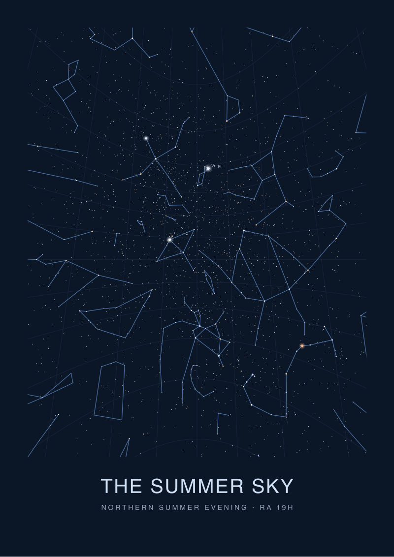 The Summer Sky
The print from this article · from €29.95
View the print →
The Summer Sky
The print from this article · from €29.95
View the print →
Question 2: Is Your Room Lit by Daylight, Tungsten, or LED?
The second fork. A palette that reads blue-white under 5000K north-facing daylight will read grey under 2700K tungsten and will turn violet under a cheap 3000K LED with a bad CRI. This is not opinion. This is how metamerism works. Two colours that match under one light source will separate under another, and paint chips are almost always evaluated under fluorescent shop lighting that resembles neither your window nor your ceiling fixture.
Vega is functionally a colour temperature above 9000K. No room on Earth is lit that way. Whatever you pick, you are already compromising toward the warm end.
If Yes — daylight-dominant room
You have the easiest job. North-facing windows in the northern hemisphere give you cool, diffuse daylight that renders cold whites honestly. Your dominant cool white will actually read cool. Your ice-blue accent will hold. You can push the palette slightly further toward the star than any other lighting condition allows. Test paint samples at midday and again at 4pm — the shift matters, but it will not destroy the scheme.
If your window faces south or west, particularly in latitudes below 40°, warm afternoon light will bias every "cool" pick toward yellow. Compensate by picking a paint one full step cooler than what looks right on the chip in the shop.
If No — tungsten or warm LED
Then a literal Vega palette is a losing fight. Warm bulbs at 2700K will drag every cold white you own into cream. The honest move is to reframe: pick a palette that reads as Vega under your specific bulbs, not one that would match Vega under laboratory conditions. That usually means starting with a white that looks slightly, uncomfortably blue under daylight, so that once your tungsten warms it, it lands as neutral rather than yellow.
The alternative is to change the bulbs. High-CRI LEDs at 4000K to 5000K are widely available now, and they cost less than repainting. If Vega is genuinely your reference, spend on the bulbs before you spend on the paint.
Question 3: Are You Painting a Wall, or Choosing a Textile?
The third fork. Colour on a wall behaves differently from colour on fabric, and Vega — being a point source of light rather than a pigmented surface — translates badly to either without adjustment. Walls are matte, textiles are woven, and both refract light on scales that a paint chip does not simulate.
If Yes — you are painting a wall
Then you are working with reflected light off a matte surface, which will always read one or two shades darker and warmer than the chip in the shop. Order the largest sample pot the retailer will sell you, paint a metre square on the wall you actually plan to cover, and look at it over a full day cycle. Do this before you commit to more than one litre.
Also: satin and eggshell finishes reflect more light than matte, which will pull a cool white further toward the reference. If the room is dim and you want the palette to hold, finish matters as much as pigment.
If No — you are choosing textiles
Then you are working with woven fibres, and the palette rules invert. A linen dyed to match your wall white will read cooler and lighter, because the weave scatters light. A wool at the same nominal colour will read warmer and denser. Silk in any Vega-adjacent white will pick up whatever coloured light is bouncing around the room and amplify it. This is why textile-based Vega palettes tend to lean into the photograph side of Question 1 — the fabrics need the tonal range or they collapse into a beige puddle.
The single move that saves a textile palette: pick your accent in the fibre first, then match the wall to it. Not the other way round. Woven colour has less range than paint and needs to be the anchor.
If You Answered Everything: The Decision Table
Eight combinations. One recommendation per row. Read across; do not skim.
| Q1: Star or Photograph? | Q2: Light Source | Q3: Wall or Textile | Recommendation |
|---|---|---|---|
| Star | Daylight | Wall | Cool gallery white dominant, single desaturated ice-blue accent, matte finish, tested on the actual wall. |
| Star | Daylight | Textile | Anchor in a woven ice-blue linen, walls in the coolest paper white the retailer stocks, no third colour. |
| Star | Tungsten/LED | Wall | Change the bulbs to 4000K high-CRI before painting; then apply the daylight-wall recommendation. |
| Star | Tungsten/LED | Textile | Reference is unachievable in this room; either upgrade bulbs or shift to the photograph-side palette below. |
| Photograph | Daylight | Wall | Cool white walls, deep midnight-blue feature wall or ceiling, one lilac or champagne textile as the single warm note. |
| Photograph | Daylight | Textile | Layered neutrals in linen and wool, one dusty violet cushion or throw, walls kept off-white to let the fabric carry the palette. |
| Photograph | Tungsten/LED | Wall | Warm-friendly palette: cream walls, deep navy accent wall, brass fittings, treat the "Vega" reference as thematic not literal. |
| Photograph | Tungsten/LED | Textile | Velvets and wools in navy, plum and champagne; forget the star, keep the mood; call it what it is. |
The table is the whole point. If you find yourself in row three or four and unwilling to change your bulbs, you have already answered the deeper question: you do not actually want a Vega palette, you want the marketing of one. That is a fine thing to want. It is not the same thing.
One caveat the table cannot show. Rooms are not single-variable. A north-facing wall in a south-facing house will read differently from a south-facing wall in the same house, and the palette that survives in one corner may collapse in the other. The recommendations above assume the room is lit consistently. Adjacent rooms with different light sources will read the palette against each other, and the honest fix is to zone the palette by lighting condition rather than by architectural continuity.
What Sky Atlas Would Actually Hang on the Wall
We plot before we draw, and the honest answer to "what colour is Vega" starts at magnitude 0.03 and ends at a spectral class. Everything between is interior decoration, and interior decoration is a legitimate craft — but it is not astronomy, and pretending otherwise is how you end up with a lilac feature wall named after a star that is, in fact, one of the coldest naked-eye whites in the northern sky.
If you have worked through the three questions and you still want a Vega reference in the room, hang the star chart, not the swatch. A plotted map of the Lyra field — Vega at magnitude 0.03 as the anchor, Sheliak and Sulafat framing the parallelogram below it, the Ring Nebula sitting quietly between them — carries the reference honestly. The colours in the room can then be whatever the room needs. The star is on the wall as the star, not as a paint chip that lost an argument with a monitor. Our own Lyra print does this at the scale we would hang it ourselves.
Which leaves the next question, the one this piece does not answer. If Vega is a magnitude 0.03 anchor in summer, what happens to your palette in December when Lyra sets before dinner and Orion owns the sky? The winter reference is Rigel, another blue-white giant with its own photographic mythology and its own room-lighting problems. The chartmaking is the same. The paint chips are not. That is where the next handbook starts.
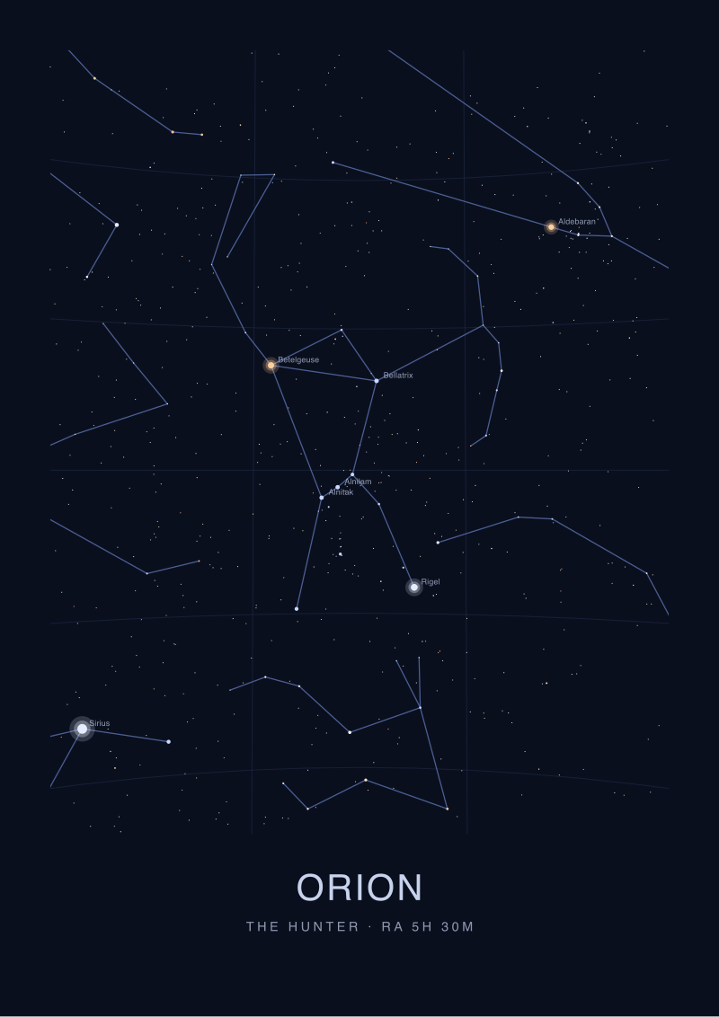 Orion
The print from this article · from €29.95
View the print →
Orion
The print from this article · from €29.95
View the print →
FAQ
Is there an official "Vega colour palette" endorsed by astronomers?
No. Astronomers describe Vega by its magnitude (0.03 in the HYG catalogue) and its spectral class (A0V, meaning hot main-sequence hydrogen-fusing), which together imply a very slightly cool white to the naked eye. There is no official palette. Every "Vega palette" sold by interior retailers is a designer's interpretation of an astrophotograph, not a measurement of the star itself. Use one if you like the aesthetic, but do not treat it as astronomical truth.
Why do photographs of Vega show colours that are not blue-white?
Camera sensors saturate on bright point sources, producing bloom, diffraction spikes and colour bleed that are artefacts of the imaging chain rather than properties of the star. Long-exposure frames of the Lyra region also capture nebulosity, interstellar dust and background stars that stain the surrounding field with lilacs, blues and faint reds. White-balance decisions during processing then shift everything again. The photograph is a legitimate mood board; it is not a colour reading of Vega.
What paint colour comes closest to matching Vega under normal room light?
Under warm bulbs at 2700K, nothing matches. Under high-CRI LEDs at 4000K to 5000K or under diffuse north-facing daylight, a very cool "gallery white" or "high-north light" from any professional paint range comes closest. Avoid anything labelled greige, cream or off-white — those lean warm. If the chip looks slightly, uncomfortably blue in the shop's fluorescent lighting, that is usually the correct pick for a daylight-lit room.
Can I still use lilac and champagne if I want a Vega-themed room?
Yes, but call it what it is: a palette inspired by astrophotographs of the Lyra region, not by Vega itself. Those hues come from nebulosity around the star and from processing choices, not from the star's spectrum. Frame the design honestly — an "astrophotography-inspired" palette is a real thing with real visual logic. A "Vega palette" claiming to match the star's colour with lilac is misrepresenting the physics.
Does the colour of Vega change over time?
Not on any timescale relevant to painting a room. Vega is a stable A0V main-sequence star, and its apparent colour to human eyes has been essentially the same throughout recorded observational history. Its position drifts slightly due to precession — the celestial pole is moving toward it and Vega will be a rough pole star around the year 13,700 CE — but the colour and magnitude are effectively fixed on human timescales. Any change you perceive is atmospheric or lighting-related, not stellar.
Why does the same white paint look different on my wall than on the paint chip?
Two reasons. First, the chip is small and printed on smooth card, while your wall is large and matte, so it reflects light differently and reads darker and warmer. Second, the shop uses fluorescent lighting that renders colours differently from your home's bulbs or windows. Always buy the largest sample pot available, paint at least a square metre on the actual wall, and check it across a full day before committing.
Is Vega visible from the southern hemisphere?
Yes, but only from latitudes north of roughly 51° south, and it stays low on the northern horizon rather than passing overhead. From most of the populated southern hemisphere — Australia, most of South America, southern Africa — Vega is a seasonal visitor sitting close to the horizon during the southern winter months. If you are designing a room in Sydney or Buenos Aires around a "summer sky" reference, Vega is not your star. The Southern Cross is.
What is the single biggest mistake people make matching a room to a star?
Treating the star as a decorating theme rather than as a colour reading. Vega has one colour: a slightly cool white anchored by an even colder undertone. Everything else marketed under its name is either the surrounding sky, the processing pipeline, or a designer's mood. If you want the star, the palette is narrow and disciplined. If you want the mood, admit it, and stop pretending the star endorsed your lilac cushion.
From the collection
New charts and 10% off your first print.
One email now with your code. No noise after.