Most star maps sold as wall art are decoration pretending to be data. Hear me out. The frame is real, the paper is real, the ink is real. The sky on the paper is often not. It is a stock illustration of "night" with dots scattered by a designer's eye rather than by a catalogue, printed at a size that flatters a living room instead of the sky. That is fine as ornament. It is not a map. A map has to agree with the sky it claims to show, and most prints fail that test the moment you look up.
This piece is about what to look for before you buy one. The answer is not universal. It depends on why you want the print on the wall in the first place. So we will walk through three hypothetical buyers — a gift purchaser, a designer specifying for a client, and a reader who wants a working reference — and check each scenario against the same short list of technical criteria: catalogue source, magnitude discipline, hemisphere honesty, and date computation. The personas are composite illustrations, not people we have met. The criteria are not.
Scenario 1: The Anniversary Gift Buyer
Imagine a buyer commissioning a "night you were born" print for a partner's fortieth. The date is fixed. The location is a specific hospital. The reader will hang the print above a bed and look at it for the next twenty years. What matters here is not aesthetic — it is whether the sky on the paper matches the sky that was actually there that night.
Three failure modes are common in this scenario, and all three are easy to check before purchase.
The first is date computation. A real personalised star map runs the given timestamp through a coordinate transformation that accounts for the observer's latitude, longitude, local sidereal time, and — for a precision studio — the precession of the equinoxes over the intervening decades. The result is a specific hemisphere of sky, rotated to what was overhead at that instant. A print that generates the same-looking chart regardless of the input date is not doing this computation. Ask the studio to describe what happens between "form submitted" and "chart drawn". If the answer is aesthetic, decline.
The second is magnitude discipline. The grounding is straightforward: the brightest star in the northern hemisphere sky, Arcturus in Boötes, sits at apparent magnitude −0.05. Vega, in Lyra, sits at 0.03. Capella, in Auriga, at 0.08. These three should be visibly distinguishable on any honest chart — not identical dots, not arbitrarily scaled by drawing style. If the print treats every named star as the same size, or scales them by "importance" rather than brightness, the buyer is receiving a diagram, not a chart.
The third is hemisphere honesty. A print of "the sky above Buenos Aires on 12 July 1986" should not show the Big Dipper as its centrepiece. It should show Rigil Kentaurus, at declination −60.83°, prominently — because at that latitude, that star is a genuine anchor. A studio that produces the same visual template regardless of southern versus northern input is selling a Northern-Hemisphere-shaped decoration with a caption swapped in.
The test question for this buyer: can the studio show you two prints with dates six months apart, from the same city, side by side? If the two skies look identical, they are decoration. If they look meaningfully different — different constellations dominant, different bright anchors — the studio is running the numbers.
Scenario 2: The Interior Designer Specifying for a Client Wall
Picture a designer selecting a large-format print for a client's dining room. The brief is aesthetic. The client will never verify whether Sirius sits at the correct declination. The designer's incentive, on paper, is to pick whatever looks best at three metres. This is the scenario in which the industry gets away with the most, and it is the scenario where the designer's own judgment matters most, because nobody else will check.
The relevant criteria shift. Date accuracy is less critical — the print is not commemorating an event. Hemisphere honesty and magnitude discipline still matter, and for a specific reason: guests do look up. A dinner guest who happens to know that Canopus is the second-brightest star in the sky at magnitude −0.62, sitting deep in the southern hemisphere at declination −52.70°, will notice immediately if a print labelled "the winter sky" places Canopus above a Cassiopeia dominant in the same frame. Those two stars are not visible from the same latitude in the same night. Putting them together on a single chart is the celestial equivalent of drawing a beach next to a glacier and calling it a landscape.
The technical checklist for this buyer is shorter but sharper. First, source: the print's fine print or product page should name a catalogue. HYG (the Yale Bright Star Catalogue derivative), Hipparcos, Tycho-2 — these are real, versioned, publicly documented datasets. A print that names none is drawing stars from imagination. Second, projection: the studio should state whether the chart is a stereographic projection, an equatorial cylindrical projection, or a polar azimuthal projection. Each has a defensible use. "It's just a circle" is not one of them. Third, the studio should be willing to show the same city on the same date at 21:00, 00:00, and 03:00 local time and demonstrate that the sky visibly rotates between them. A print of "midnight" that looks identical to a print of "9pm" from the same city three hours apart is not being computed.
For a designer, the working question is: does this print survive the one dinner guest who happens to be an astronomer? If yes, it is a map. If no, it is wallpaper, and there is nothing wrong with wallpaper — but the designer should price it accordingly.
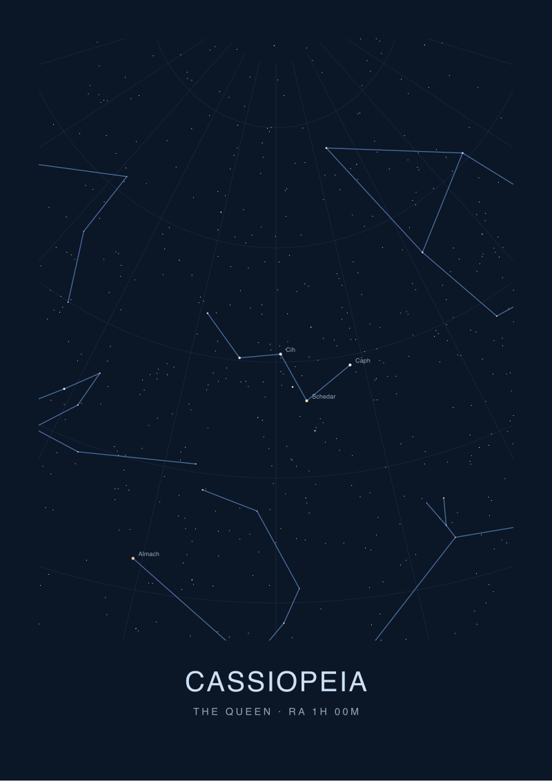 Cassiopeia
The print from this article · from €29.95
View the print →
Cassiopeia
The print from this article · from €29.95
View the print →
Scenario 3: The Reader Who Wants a Working Reference
Let us say a reader wants a print above a desk that they can actually consult. They are learning the sky. They want the print to teach them where Sirius is in relation to Canopus, why Arcturus rises when Vega is still high, what the summer triangle looks like as a projected geometry rather than a myth.
For this buyer, the criteria invert. Aesthetic softness works against them. A print that renders every star as a beautifully diffuse glow is unreadable at desk distance — the reader cannot count magnitudes, cannot trace constellation lines, cannot use the print as a checklist against the sky through the window.
The technical checklist tightens. Magnitude scale must be logarithmic and visible: the difference between Sirius at magnitude −1.44 and Vega at 0.03 is roughly a factor of four in apparent brightness. On the print, that ratio should be legible. Constellation lines should follow the IAU-sanctioned figure conventions, not the studio's stylised improvisation. Coordinate grids — right ascension and declination — should be present, at least as fine ticks along the border. Without a grid, the print is a picture. With a grid, it is a chart.
One more test, specific to this reader: the print should credit the epoch. Star positions drift measurably over decades because of precession and proper motion. A serious print will state J2000.0 or a more recent epoch. If the print does not name an epoch, the studio does not know what an epoch is, and the reader should assume the positions are approximate at best.
For this scenario, size matters less than resolution. A modest print with a real grid and honest magnitudes teaches more than a large print with none of those.
What All Three Share
Three scenarios, three sets of priorities, one shared spine.
Every honest star map, regardless of buyer, agrees to be checked. It names its catalogue. It states its projection. It respects the magnitude scale — which runs backwards, brighter stars carrying smaller (more negative) numbers, a convention astronomers refuse to fix. It draws the hemisphere it claims to draw. It computes rather than illustrates.
The failure mode that unites bad prints across all three scenarios is the same: they treat the sky as a mood board. Constellations are drawn where they look nice on the page rather than where they sit in the coordinate system. Bright stars are scaled by narrative importance rather than by apparent magnitude. The zodiac band, if shown, is often drawn as a decorative ribbon rather than as the coordinate strip it actually is — a slice of the sky the ecliptic passes through, nothing more.
There is also a shared honesty test. The studio should be willing to say what the chart cannot do. A print of the sky above Reykjavík in June cannot show the same stars as one from Cape Town in the same month, because the observers are looking in different directions. A studio that acknowledges this in its product copy is running the maths. A studio that offers "the sky above any city, any date" with a single template is not.
The stars in the grounding for this piece — Sirius, Canopus, Arcturus, Rigil Kentaurus, Vega, Capella — span both hemispheres and cover a magnitude range from −1.44 to +0.08. Any print that claims to show "the brightest stars" and cannot render that ordering visible on the paper is failing at the one job the paper has.
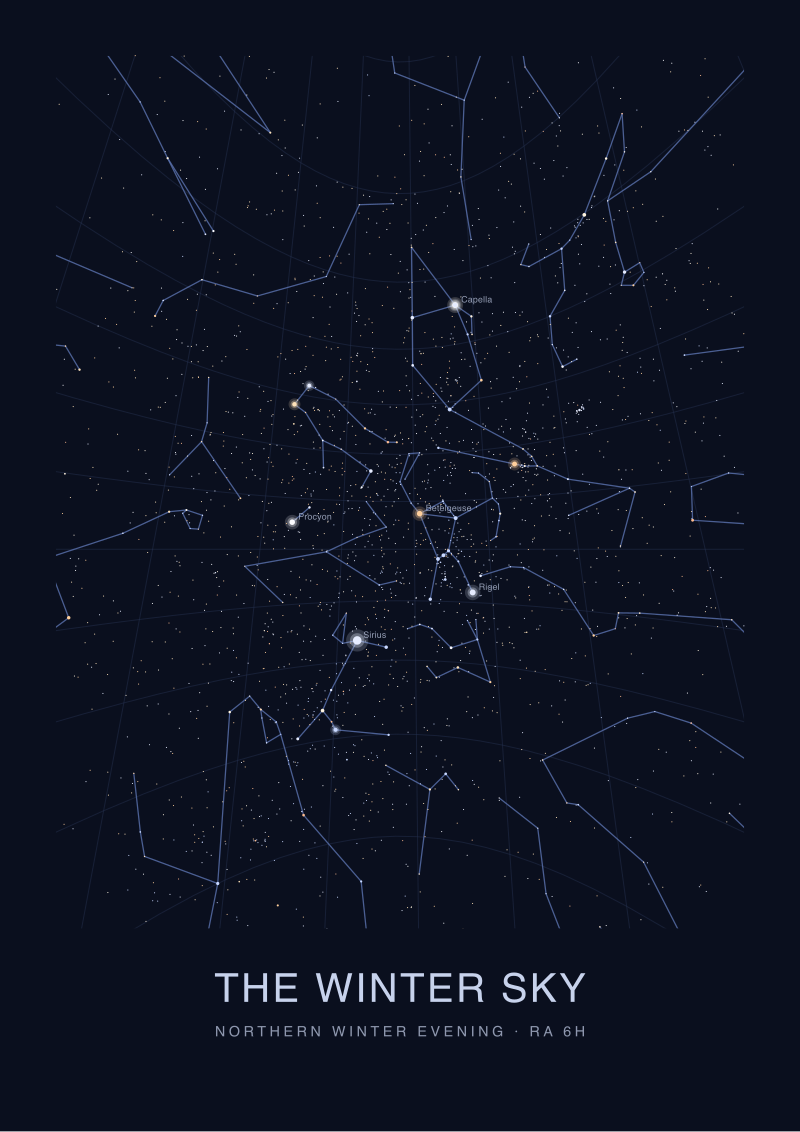 The Winter Sky
The print from this article · from €29.95
View the print →
The Winter Sky
The print from this article · from €29.95
View the print →
Which Scenario Is You
The gift buyer needs date computation, hemisphere honesty, and studio transparency about how the chart is generated. Ask for a second chart at a different date to prove the pipeline exists.
The designer needs the print to survive expert scrutiny at three metres — which means the sourcing and projection have to be defensible even if aesthetics dominate the selection. Ask for the catalogue name.
The reader-as-user needs grids, epochs, and magnitude discipline over size and softness. Ask for J2000.0 or later, and check that constellation lines follow IAU convention.
If none of the three fits — if the print is simply going on a wall because the room asked for something on that wall — that is a legitimate purchase. It is also not a map, and the studio charging map prices for it is overreaching. Our own prints at see the Cassiopeia print are built to survive the reader-as-user test, which is the strictest of the three; they pass the other two by construction.
Honest Limits
This piece does not address framing, paper stock, or ink longevity — those are printer-craft questions and we are a cartography desk, not a print shop. It does not address the choice between hemisphere-centred, equatorial, or polar projections at the level a working navigator would want; that is a longer conversation about what the reader intends to do with the chart. And it does not cover software-generated planetarium prints, which are a category of their own and demand their own checklist. Each of those deserves its own piece.
FAQ
How do I check whether a star map print is actually computed from real data?
Ask the studio to name the catalogue. Real catalogues have names and version numbers — HYG v41, Hipparcos, Tycho-2, Yale Bright Star. If the studio cannot answer, or answers with marketing language, the print is illustration, not computation. A second test: request two prints from the same city six months apart. The skies should look meaningfully different. If they look identical, the pipeline is aesthetic.
Does the size of the print affect its accuracy?
No. Accuracy is a function of the underlying catalogue, projection choice, and magnitude scaling — all of which are independent of physical dimensions. A small print with a real coordinate grid and honest magnitude ordering is more accurate than a wall-sized print without them. Size affects legibility and desk-versus-wall use, not whether Sirius sits where Sirius belongs.
What is the magnitude scale and why does it run backwards?
The apparent magnitude scale is logarithmic and inverted: brighter objects carry lower numbers. Sirius sits at −1.44, Canopus at −0.62, Arcturus at −0.05, Vega at 0.03, Capella at 0.08. The convention descends from a second-century Greek ranking (magnitude 1 for brightest visible stars, 6 for faintest) that modern astronomy formalised rather than replaced. An honest print renders this ordering visibly through dot size.
Should the print show the whole sky or a hemisphere?
Depends on the intent. A whole-sky projection compresses both hemispheres into one frame and distorts one or both — useful as an overview, misleading as a locator. A hemisphere-specific chart, honestly labelled ("sky above 40°N, midnight, 15 June"), is what the buyer actually needs if the print is meant to correspond to a real observing location. Whole-sky is a summary; hemisphere is a map.
Are personalised "birth night sky" prints real astronomy or illustration?
Both categories exist and they charge similar prices. The real ones run the timestamp through a coordinate transformation accounting for latitude, longitude, sidereal time, and epoch. The illustrated ones apply a template. Test by requesting the same date at two locations 3,000 kilometres apart, or the same location at two dates six months apart. If the outputs are visually distinct, the studio is computing.
What about zodiac-themed star maps?
The zodiac is a coordinate band — the strip of sky the ecliptic passes through, containing thirteen constellations that the Sun's apparent path crosses through the year. It is a real feature of celestial geometry. Zodiac-themed prints that treat it as such are legitimate cartography. Prints that assign personality traits or predictive claims to zodiac signs are astrology, which is not astronomy, and we do not stock them.
How often should the star positions be updated?
For wall-art purposes, effectively never within a human lifetime. Star positions do drift because of precession and proper motion, but the visible sky changes on scales measured in centuries for most naked-eye stars. A print anchored to epoch J2000.0 will remain accurate to naked-eye precision for decades. The epoch matters more as a sign that the studio understands the concept than as a practical expiration date.
From the collection
New charts and 10% off your first print.
One email now with your code. No noise after.