People assume a star map begins with a pen. It begins with a table. Before we drew a single dot for the current print, the file open on the desk was a HYG v41 export with six anchor stars in it: Sirius at apparent magnitude −1.44 in Canis Major, Canopus at −0.62 in Carina, Arcturus at −0.05 in Boötes, Rigil Kentaurus at −0.01 in Centaurus, Vega at 0.03 in Lyra, Capella at 0.08 in Auriga. Six numbers, six coordinates. Everything a reader will one day call beautiful is downstream of that spreadsheet.
We say this every time somebody asks how we make our charts, and every time it lands as a small disappointment. The romantic version of celestial cartography imagines a chartmaker at a window with a pencil, translating what they see. The honest version imagines a chartmaker at a screen, sorting rows by declination and arguing with themselves about which stars are too dim to earn ink. Both versions end in a print you can hang on a wall. Only one of them produces a print that is actually correct.
What follows is a working note. It is not a how-to and it is not a manifesto. It is what the desk does, in the order we do it, when a new plate goes into production.
A Star Map Is a Catalogue Before It Is a Drawing
Every map we make starts as a filtered catalogue. The HYG database — a merged compilation of the Hipparcos, Yale Bright Star and Gliese catalogues that most modern star chart software leans on — is a plain table. Each row is a star. Each row carries, at minimum, a right ascension in hours, a declination in degrees, an apparent magnitude, and, if the star has one, a proper name. That is the raw material. There is nothing pictorial about it. The Milky Way, in this file, is a density of rows.
The first decision a chartmaker makes is not aesthetic. It is a magnitude cut. If we let the entire HYG catalogue onto the paper, we would draw something on the order of a hundred thousand points and the print would read as noise. So we pick a limiting magnitude — say, everything brighter than magnitude 6, which is roughly the naked-eye limit under a dark rural sky — and everything fainter is dropped from the file before the drawing engine ever sees it. That single threshold determines whether the map looks like a wall of stars or a legible sky. It is the most consequential aesthetic choice on the entire chart, and it is made in a spreadsheet.
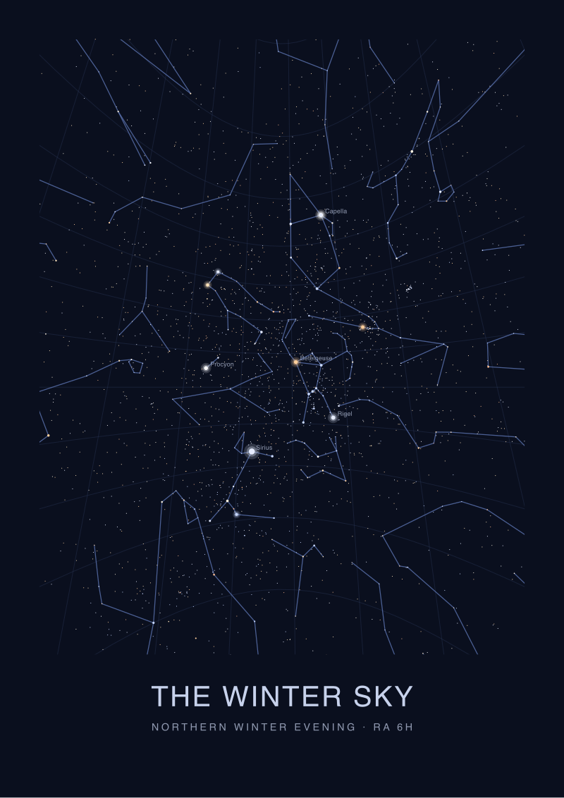
The second decision is which stars get names. Names are precious real estate. If we label every star that has a name in the catalogue, the labels collide and the chart becomes a phone book. So we filter again, usually by a stricter magnitude cut for labels than for dots. Sirius, at −1.44, is labelled on every chart we produce; there is no version of a northern-hemisphere winter sky that does not name it. Capella at 0.08 makes the cut on almost anything covering Auriga. Something four magnitudes fainter than Capella may exist on the map as a dot but will never carry its own name unless a constellation line runs through it and requires the reader to identify it.
The third decision is what to add that is not in the catalogue at all. Constellation lines are not astronomical objects. There is no row in HYG for the shape of the Big Dipper or for the outline of Orion. Those are cultural overlays, and every publishing house draws them slightly differently. The set most star cartographers use today derives from a 1930s IAU boundary convention crossed with a modern figure convention popularised by H. A. Rey in the 1950s. We choose a figure set, we snap the endpoints of each line to the catalogue coordinates of the stars they connect, and we admit in the legend which convention we followed. This is where the map stops being purely descriptive and starts being an argument.
The catalogue is not the map. But the map cannot lie about the catalogue. Every dot we place has to sit at the coordinate the row specifies, at a size scaled from the magnitude the row specifies. If a chart shows Arcturus and Vega as the same brightness, the chartmaker did not consult their table. Arcturus is magnitude −0.05 and Vega is magnitude 0.03; the difference is small but it is real, and on a well-drawn plate Arcturus is drawn very slightly larger. Anyone who tells you this level of care does not matter has never seen a chart that gets it wrong.
Projection Is Where the Sky Stops Being Honest
The sky is a sphere. Paper is a plane. Every star map in history is a lie of some specific kind, and choosing the lie is the most technical decision on the desk. This is what cartographers call projection, and it is where celestial mapping inherits every argument that terrestrial mapping has been having since Mercator.
The core problem: you cannot flatten a sphere onto a rectangle without distorting either the shapes of things or the distances between them or the areas they cover. You can pick which two you will preserve and which one you will sacrifice. On Earth, everyone knows this because Greenland on a Mercator map is the size of Africa when it is in fact fourteen times smaller. In the sky, the same distortions happen and nobody talks about them, because most readers never overlay two star charts to notice.
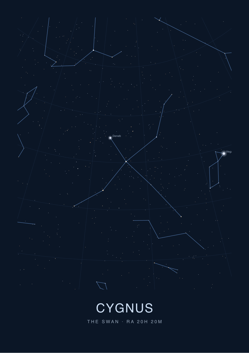
For a chart that shows a small region of sky — a single constellation, or a facing pair — we typically use a stereographic projection centred on the constellation. Stereographic preserves angles locally, which means the constellation figures look correct in shape, and any circle drawn on the sphere is still drawn as a circle on the paper. The cost is that the further you get from the chart's centre, the more distances stretch. That is fine when the map only covers twenty degrees of sky. It is not fine when the map tries to cover a whole hemisphere.
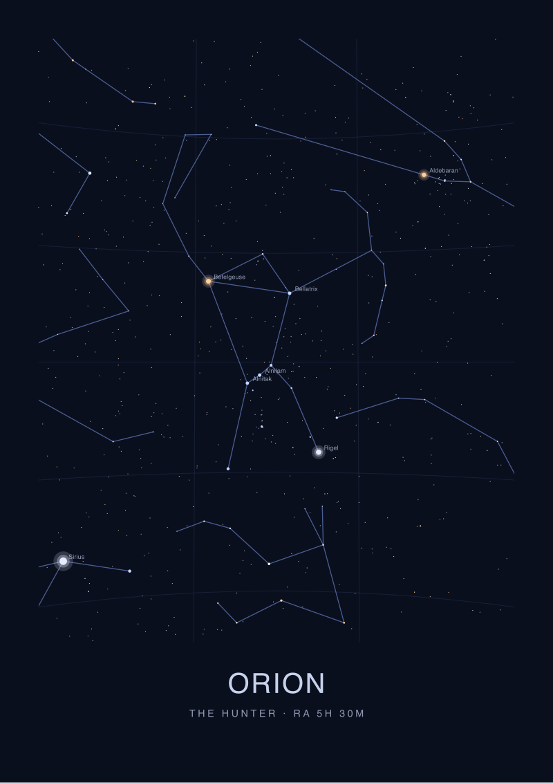
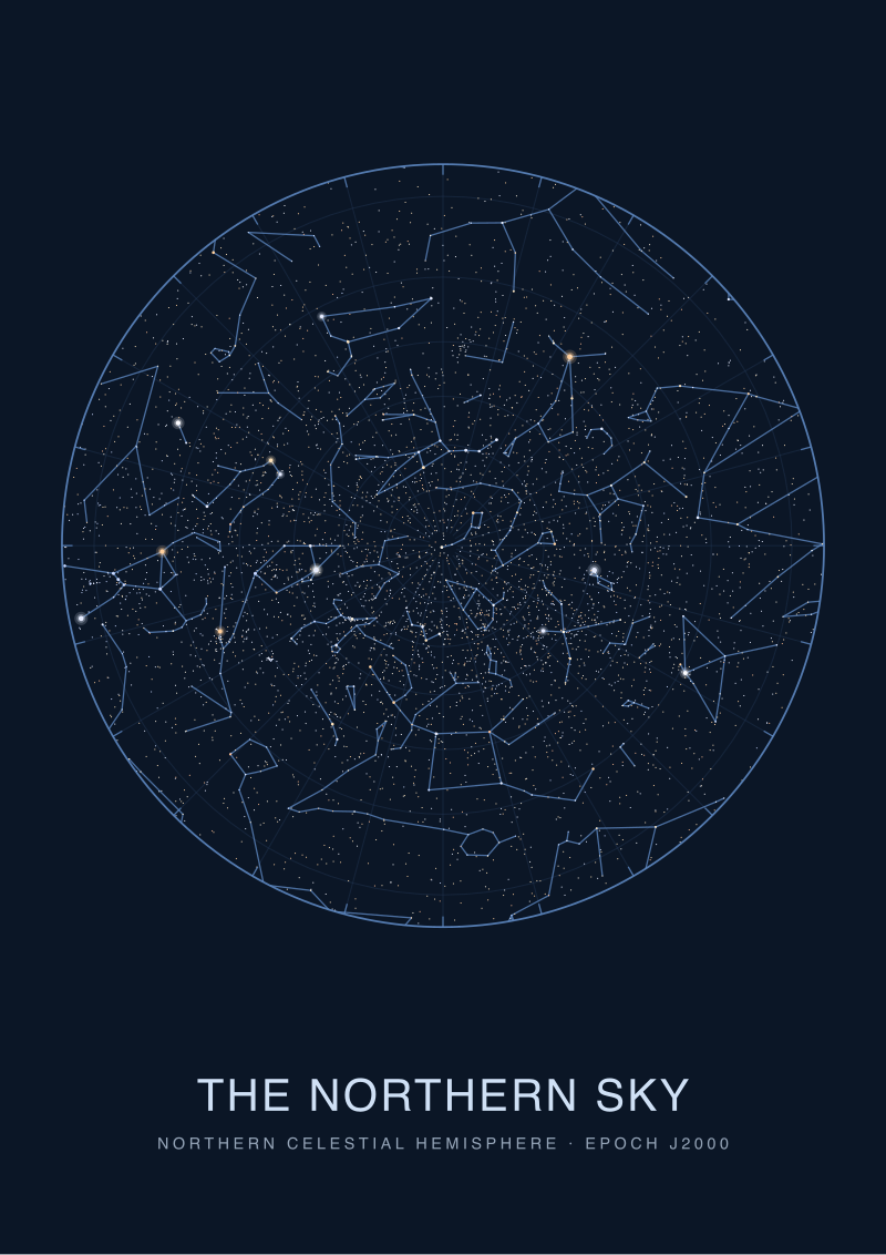
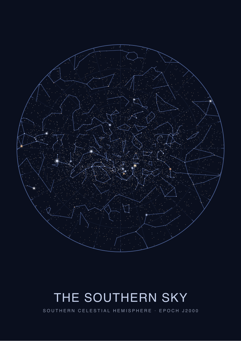
For a whole hemisphere — the classic circular star chart with the pole at the centre and the celestial equator at the rim — we use a polar azimuthal equidistant projection. Distances from the pole are preserved. Shapes near the rim are stretched sideways. This is why Orion looks wrong on a hemisphere print. It is not the chartmaker's error. It is the projection doing what projections do, and any chartmaker who draws Orion small enough to look right on a polar hemisphere plate has distorted the coordinate grid to do it, which is a worse crime.
For the full sky on a single sheet we use a Hammer or Aitoff projection, borrowed directly from atlas cartography, which trades some shape correctness for the ability to show the entire celestial sphere in one continuous frame. This is the projection we choose when the Milky Way itself is the subject and the reader needs to see it stretching from Sagittarius across Cygnus and back down toward Puppis without breaks. It is beautiful. It is also the most dishonest thing we sell, in the technical sense, because it distorts angle, area and distance in different measures across the frame. The honesty is in labelling it as what it is.
Projection also decides which stars fit on the plate at all. Canopus is at declination −52.7 and Rigil Kentaurus is at declination −60.8. On a northern-hemisphere polar chart with the celestial equator at the rim, both stars are cut. They live below the frame. Every reader in London or Paris or New York who has bought a northern-hemisphere print and then flipped it to look for the Southern Cross has run into this. The stars are not missing because the chartmaker forgot them. They are missing because the projection could not accommodate them without swallowing the northern circumpolar detail the print was designed to show. This is a decision the reader inherits without ever being consulted. Good chartmakers say so on the label. Most do not.
 Orion
The print from this article · from €29.95
View the print →
Orion
The print from this article · from €29.95
View the print →
Magnitude, Not Prettiness, Decides What Gets Drawn
The single most misunderstood convention on any star chart is the size of the dots. Every reader assumes a bigger dot means a bigger star. It does not. A bigger dot means a brighter star as seen from Earth, which is not the same thing at all, and once you understand this the entire chart starts to read differently.
Apparent magnitude is a measurement of how much light reaches the observer. It is affected by three things: how much light the star actually emits, how far away it is, and, marginally, how much interstellar dust sits along the line of sight. A close, ordinary star can outshine a distant giant. Sirius is brilliant on our sky, at magnitude −1.44, in significant part because it is nearby by stellar standards, only about eight and a half light-years away. Canopus, at −0.62, is intrinsically far more luminous than Sirius but sits hundreds of light-years further out, which is why it draws a smaller dot on our plates despite being, in absolute terms, a monster.
The scale itself is perverse and we should say so plainly. It runs backwards. Brighter stars have lower — and eventually negative — magnitudes. Fainter stars have higher numbers. Sirius at −1.44 is brighter than Rigil Kentaurus at −0.01, which is brighter than Vega at 0.03, which is brighter than Capella at 0.08. The step of one magnitude corresponds to a brightness ratio of roughly 2.5, so a magnitude 1 star is a hundred times brighter than a magnitude 6 star. Every chart legend we produce reproduces this scale as a small ladder of dots, from the largest — reserved for anything brighter than magnitude 0 — down to the smallest, and we still get letters saying we drew the sky "wrong" because a reader expected the numbers to run the other way. The numbers do not run the other way. Hipparchus set them like this in the second century BCE and astronomers have declined to renumber the entire sky to make it more intuitive. We follow suit.
What this means for the plate is that dot size is not decoration; it is data. We use a logarithmic scaling function from magnitude to dot radius, tuned so that Sirius reads as unmistakably the largest point on any winter chart, Canopus and Arcturus and Rigil Kentaurus and Vega and Capella form a visible second tier, and the rest of the naked-eye stars grade smoothly down to the smallest dots the paper can hold without blurring. If we compressed the range and drew every star the same size, we would flatten the sky's actual visual hierarchy — the hierarchy that a person standing under a real dark sky perceives with their own eyes. The chart's job is to preserve that hierarchy on paper. Not to prettify it, not to democratise it, not to make sure every constellation has a "hero star". To show the sky the way it actually shows itself.
There is a version of this craft where the chartmaker fudges the magnitudes to make a favourite constellation more prominent, or scales up a star that got dimmed by dust so that the drawn figure looks tidier. We do not do this. Every dot on every plate we send to press comes from a magnitude in the HYG catalogue, run through the same scaling function, without exceptions. If a constellation looks weaker on our chart than it does in a picture book, that is because the picture book was lying and we are not. There is no editorial reason strong enough to justify moving a star.
A Note On How This Piece Evolved
This started as a straight explainer — a how-we-make-them note, three steps, done — and turned into something closer to an admission. Every time we tried to describe a step, the interesting part was not the step itself but the decision under it: what to leave out, which distortion to accept, which convention to inherit. A star map is a stack of honest compromises with a sky that does not fit on paper. The chart on the wall is what remains after every one of those compromises has been chosen deliberately. If you want to see how any given chart was built, the fastest route is to look at what the chartmaker refused to draw, and ask why. Our own working prints live in the /shop/, and each one carries its projection and its limiting magnitude on the label — because those two numbers, more than anything else, tell you what kind of sky you are actually holding.
 Cygnus
The print from this article · from €29.95
View the print →
Cygnus
The print from this article · from €29.95
View the print →
FAQ
What catalogue do most modern star maps actually use?
Almost every serious contemporary star chart is built from some subset of the Hipparcos and Tycho catalogues, often via the HYG compilation, which merges Hipparcos with the Yale Bright Star Catalog and the Gliese nearby-star catalogue. HYG gives the chartmaker right ascension, declination, apparent magnitude and, where one exists, a proper name for each star, in a single flat table. Older prints may still lean on the Bonner Durchmusterung or the Smithsonian Astrophysical Observatory catalogue, but new work almost never does.
Why does the same constellation look slightly different on different charts?
Because constellation figures are not astronomical objects. The IAU only fixed the boundaries between the 88 constellations in the 1920s and 1930s; it never standardised the line-figure joining the stars inside each boundary. So different publishers connect the dots differently. One chart draws Orion with a shield and a club, another draws only the torso and belt. Both can be correct because there is nothing to be correct about — the figures are cultural conventions layered on top of a fixed coordinate grid.
What is a limiting magnitude and why does it matter to the reader?
Limiting magnitude is the faintest star the chart chooses to draw. A chart with limiting magnitude 4 shows only about five hundred stars across the whole sky and reads as sparse and constellation-focused. A chart with limiting magnitude 6 shows several thousand and starts to hint at the Milky Way as a texture. A chart with limiting magnitude 8 or deeper is a technical reference for telescope users. Knowing a chart's limiting magnitude tells you immediately what it was designed to be used for.
Why does the Southern Cross not appear on many popular star charts?
Because most popular star charts are northern-hemisphere polar projections centred on the celestial pole with the equator at the rim, and the Southern Cross sits well south of the celestial equator. Rigil Kentaurus, the closest bright star to the Southern Cross, is at declination −60.8, which falls outside the frame of any hemisphere plate built for northern latitudes. Southern-hemisphere plates and full-sky Hammer projections show it clearly; northern hemisphere plates structurally cannot.
Do star maps account for precession of the equinoxes?
Yes, and this is one reason serious chart labels always carry an epoch, usually "Epoch J2000.0". Precession slowly shifts the celestial coordinate grid against the stars over roughly 26,000 years, which means a chart drawn to 1875 coordinates will show star positions that are noticeably off from a modern J2000 chart. The stars have not moved appreciably; the coordinate grid has. Modern software rotates the catalogue to the requested epoch before drawing, and a chart that does not state its epoch should be treated with caution.
Why are the magnitudes on the chart negative for the brightest stars?
Because the magnitude scale is inverted by historical accident. Hipparchus, in the second century BCE, ranked the brightest naked-eye stars as "first magnitude" and the faintest as "sixth". When astronomers later formalised the scale mathematically, they preserved that ranking, which forced the very brightest stars off the low end of the scale into negative territory. Sirius at −1.44 and Canopus at −0.62 are not oddities; they are the honest consequence of a two-thousand-year-old ranking that nobody has ever agreed to renumber.
What does the projection choice tell me about a star map?
The projection tells you which kind of distortion the chartmaker accepted. Stereographic charts preserve local shape and are good for single-constellation plates. Polar azimuthal equidistant charts preserve distance from the pole and are the standard hemisphere format. Hammer and Aitoff charts show the entire sky continuously and distort broadly but evenly. A chart without its projection named on the legend is hiding the single most important technical fact about itself, and that omission usually points to a chartmaker who did not want the reader asking the question.
From the collection
New charts and 10% off your first print.
One email now with your code. No noise after.